


 By Melody Roberts, Owner|Chief Creative Officer, Out of Home Creative.
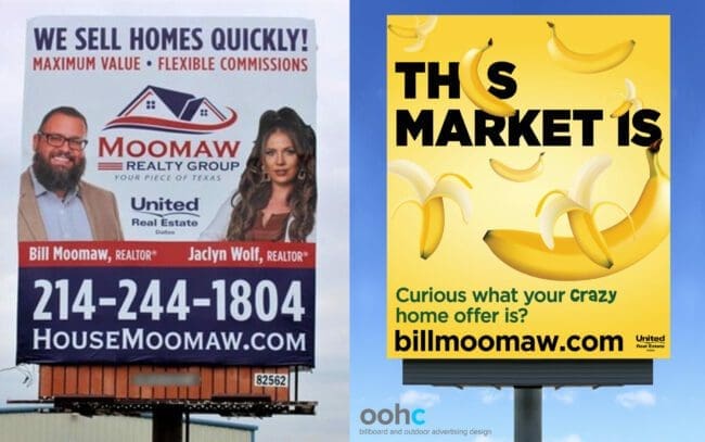
If you’re in the OOH industry, you’ve probably worked with a realtor or two or a hundred… I design at least two realtor advertisements a week, and they love advertising on street furniture and, of course, billboards. Realtors are great clients to work with, but they rarely stray from “Buying or Selling” with their photo from a design – even with my best creative pitch.
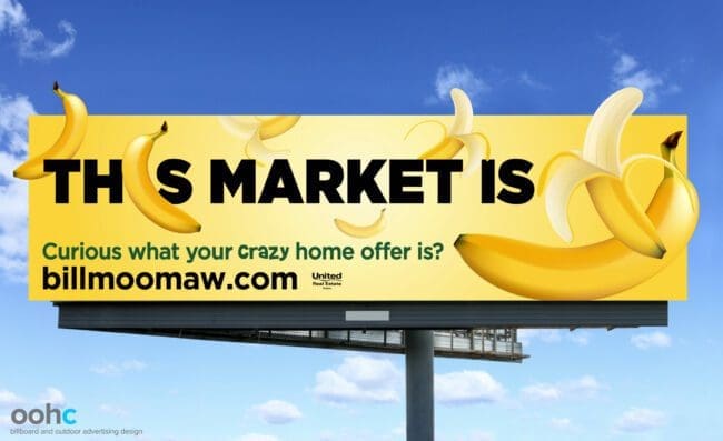
That was until I met Bill Moomaw, a real estate agent from Wills Point, Texas. I was referred to Bill by the OOH company he signed with to advertise on a bulletin. The owner of the OOH company said, “This one is for you. He wants to do something fun… I think with a banana.”
During our creative call, I learned Bill was advertising with several OOH companies in the Texas area but wasn’t happy with the creative. He explained he wanted to do something fun and a little crazy to demonstrate how the market was bananas in Terrell, Texas, for his new billboard.
Typically, realtors want (or need) all the same things in their advertisement; photo, name, title, “Buying or Selling,” two phone numbers (one small, one bigger), website, address, company logo, realtor logos, etc. But Bill said he already tried that, and it wasn’t working and was open to something different. That’s when I dove into why he felt his market was bananas and how we could take that idea and make it more exciting.
He suggested five bananas in a row, but I knew that wasn’t going to get the point across visually, nor did it feel very creative. I discussed why it was necessary to keep content to a minimum for people to see a more conceptual visual and, hopefully, make them look at the advertisement repeatedly.
So, I went a little crazy myself displaying bananas all over and extending them for visual impact. The placements I chose meant I didn’t need to have the letter “I” or “bananas” at the end of the headline because it was already implied.
Bill was awesome to work with. He trusted me to execute his vision and gave me the freedom to put my spin on it.
From the client: “I really appreciate you going above and beyond and exceeding my expectations when creating artwork for my new billboard campaign. I really appreciate the way you challenged my thought process and the intensity you created, bringing this image to life! I have received a great response from friends, family, colleagues, and passer-bys! I cannot wait to design the next one with you!!”
Bill reprinted his existing vinyls to display new artwork (original art below). After Bill’s colleague, Mike saw the creative, he contracted on a 14×48, presenting Clark Dunklin and me the opportunity to work with another new client.
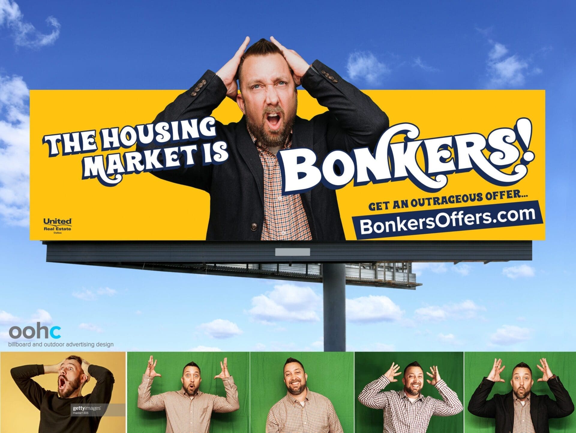
The banana billboard inspired Mike, Bill’s colleague who also wanted to use bananas. But I advised him to let me create something new just for him. We threw out ideas and landed on “bonkers.” Mike explained the billboard location was in a high-traffic area where he’s known in his community, so he wanted to use his photo, but I told him if we were going to use his picture, I wanted it to be an expressive pose to tie into his headline. Mike was 100% in, so I sent stock photo ideas of what I envisioned his pose and expression should be.
Even though I advised Mike to wear a checkered shirt and provide options with and without a dark blazer to play against different backgrounds, Mike sent photos of clothing for me to choose from, and I loved seeing how much fun he had during his photoshoot. Getty images has nothing on my client.
A special Thank you to Bill Durden, with whom I shared the concept, and Bill took it a step further with a tip that the URL www.bonkersoffers.com was available.
[wpforms id=”9787″]
Paid Advertisement


Fantastic article. Great job, Melody!