


Rate This Face allows a billboard designer to rate a random piece of billboard artwork using the following scale: 1 (not good), 2 (below average), 3 (average), 4 (very good), 5 (great). Then the designer talks about what they may have done differently for outdoor advertising. This week’s rating is provided by Greg Callaham www.gregcallaham.com) who has 30 years of experience in outdoor advertising design. Insider has used and endorses Callaham’s services.
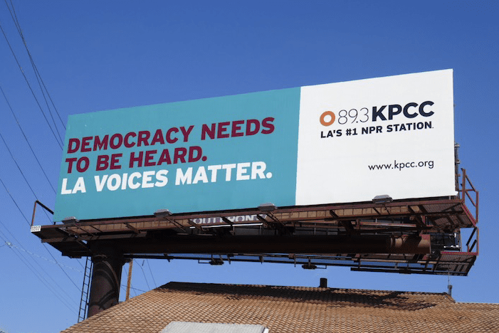
Ad: KPCC
Rating: 3 (average)
- This ad for KPCC is a simple design relying on color blocks and block text to convey the message. Contrast increases legibility when designing outdoor and this illustrates that truism extremely well.
- Notice how the right side of the board keeps drawing your eye. It has more contrast and similarly sized and styled text at the same height as the headline, along with a little splash of a bright color. It’s more interesting and easier to read, so we try to read it first.
- The maroon text doesn’t “pop” against the teal background because there is simply not enough contrast. It tries to blend in because the color values are so closely related.
- The radio station feels very strongly about this message, yet it is overpowered by the station logo. This one gets a 3 (average).
While I can only speculate about the parameters given to the designer on this ad, I would have encouraged the use of the design below. It uses the bright orange from the station logo to catch the eye and hold it. The white text has enough contrast to be easy to read. A version of this ad on the station web site features an old microphone and this design maintains that visual continuity. The logo takes a secondary position to the message but maintains legibility. In short, the message is broadcast clearly and loudly, and the audience knows who said it.


Beautifully redesigned.
Thank you, sir!