


Rate This Board allows a billboard designer to rate a billboard ad using the following scale: 1 (not good), 2 (below average), 3 (average), 4 (very good), 5 (great). Then the designer recommends how to improve the ad. This week’s rating is provided by Melody Roberts, an OBIE nominated billboard designer and founder of Out of Home Creative, an outdoor advertising design firm specializing in out of home design for businesses, agencies, media buyers and out of home companies. Melody has been in the outdoor industry since 1999. Insider uses and endorses her services.
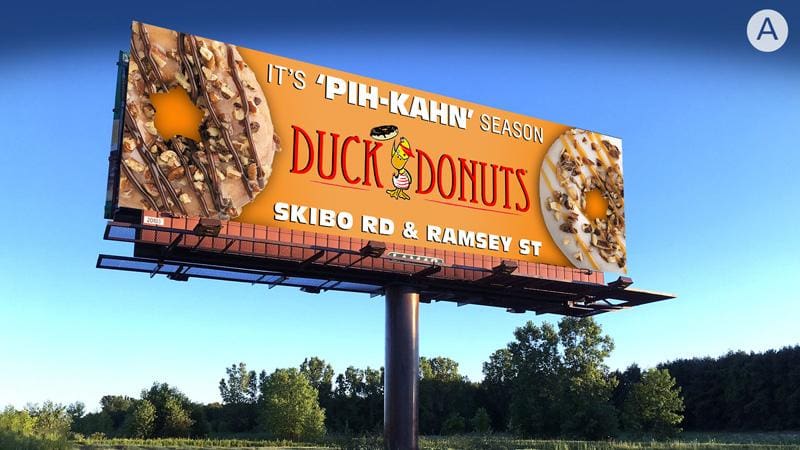
Duck Donuts
Rating: 2 (below average)
Please Note: For all ratings, I don’t know if a client insisted on certain elements or how much experience the designer had with out of home advertising. My recommendations requested by Billboard Insider are solely based on how I would have approached the creative design.
- I love the heading, and I want to like this, but I think it fell short of its potential.
- I went to Duck Donuts website, which is very playful with its font styles, colorful usage of Pink and fun chalkboard with graphics throughout the site. Pink would have looked great for OOH.
- I would not have used a plain font after looking at the whimsical fonts used for their company.
- I don’t know if the designer was instructed to use Orange to reinforce the Pecans/Fall, but for OOH, I think Orange next to Brown translates a little dull; the logo isn’t standing out, and the drop shadow on the donuts looks muddy.
- The font is too thin on either side of the header and placing the Black stroke (or drop shadow) makes it harder to read.
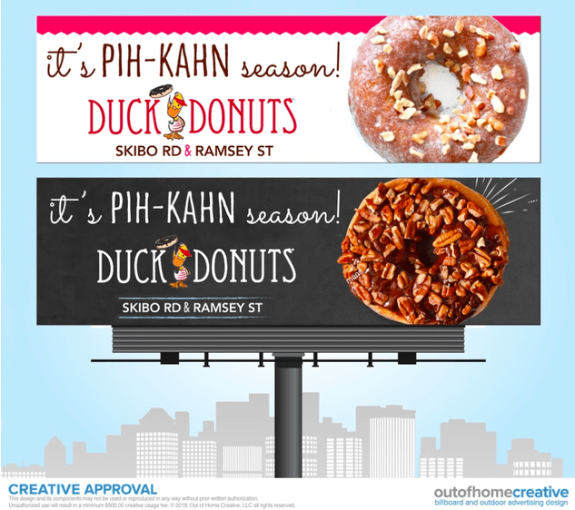
I would have recommended the following:
- Use a different color background, maybe White, and pop their Pink as a header banner or Pink background with reversed White.
- Place one or two donuts on the Right side and layer them, so the visual is on one side. The second donut could have been smaller and therefore seen better instead of both being cropped off.
- The logo would have stood out more against a white background.
- The header and location could have been written in one of their playful fonts to keep the fun going and shown in two colors; Black and Pink.
Based on their Duck Donuts website, I’ve put together two very quick rough mock-ups using similar fonts from their website, and pecan donut examples found online to show a visual of what I’m trying to explain above.
[wpforms id=”9787″]
Paid Advertisement


Great revisions. My initial grade of the billboard was much more generous, but your insights changed my mind. You’re spot on.