Rate This Board allows a billboard designer to rate a billboard ad using the following scale: 1 (not good), 2 (below average), 3 (average), 4 (very good), 5 (great). Then the designer recommends how to improve the ad. This week’s rating is provided by Melody Roberts, an OBIE nominated billboard designer and founder of Out of Home Creative, an outdoor advertising design firm specializing in out of home design for businesses, agencies, media buyers and out of home companies. Melody has been in the outdoor industry since 1999. Insider uses and endorses her services.

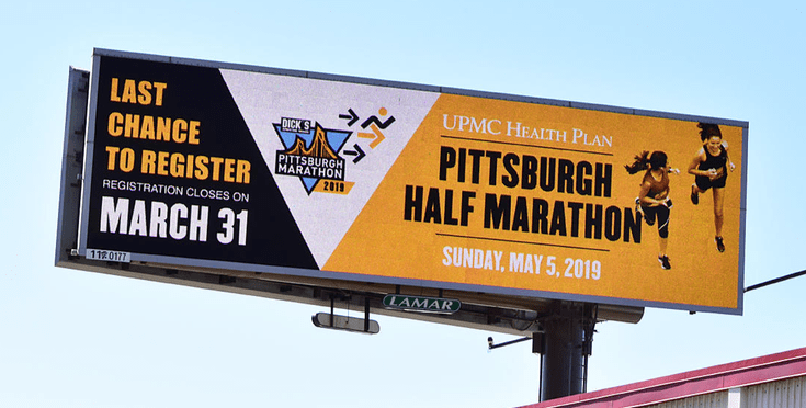
UPMC Health Plan / Pittsburgh Half Marathon
Rating 3 (average)
Please Note: For all ratings, I don’t know if a client insisted on certain elements or how much experience the designer had with out of home advertising. My recommendations requested by Billboard Insider are solely based on how I would have approached the creative design.
Upon first look, the two things I see are “March 31” and “Pittsburgh Half Marathon.” When I go back and read it, I realize the 31st is my registration deadline, not the actual date of the marathon and I don’t know where to go to register.
The overall color scheme offers good contrast for OOH, but the content could have been optimized more, and although the visual is fun, it is a little chopped up.
Here is what I would have done differently had I designed this advertisement:
- I would have placed the event name on the Left so the public can read what the advertisement is about first.
- The day (“Sunday”) doesn’t need to be on here if the date is listed.
- If the advertisement is not going to be up longer than 52 weeks or if it didn’t go up the year prior, there is no reason to list the year.
- By downsizing the information only to read “MAY 5,” it could have been much larger and more visible.
- I don’t feel the image of the runners helps this message so I would have taken them out which would have allowed, “UPMC / Pittsburgh Half Marathon / MAY 5” to be much larger. These modifications would have also provided more space for the logo to be more significant.
- I would have moved the registration information to the Right and only put, “Registration Ends March 31”. As it is now, the registration deadline information is repetitive. These modifications would have provided space for a URL so the public would know where to register and get more information about where the event was taking place, etc.
- Lastly, having White copy on top of Orange probably made the UPMC and date information hard to read from afar. I understand they were trying to split the information up, but they could have used another complimentary color.
[wpforms id=”9787″]
Paid Advertisement


Where is the website address?
“Please don’t tell me how to make the clock, just tell me what time it is.”
To much copy and not enough of a call the action or a bold graphic, 15 or more copy word points way to much.