


Rate This Board allows a billboard designer to rate a random piece of billboard artwork using the following scale: 1 (not good), 2 (below average), 3 (average), 4 (very good), 5 (great). Then the designer talks about what they may have done differently for outdoor advertising. This weeks rating is provided by Greg Callaham www.gregcallaham.com) who has 30 years of experience in outdoor advertising design. Insider has used and endorses Callaham’s services.
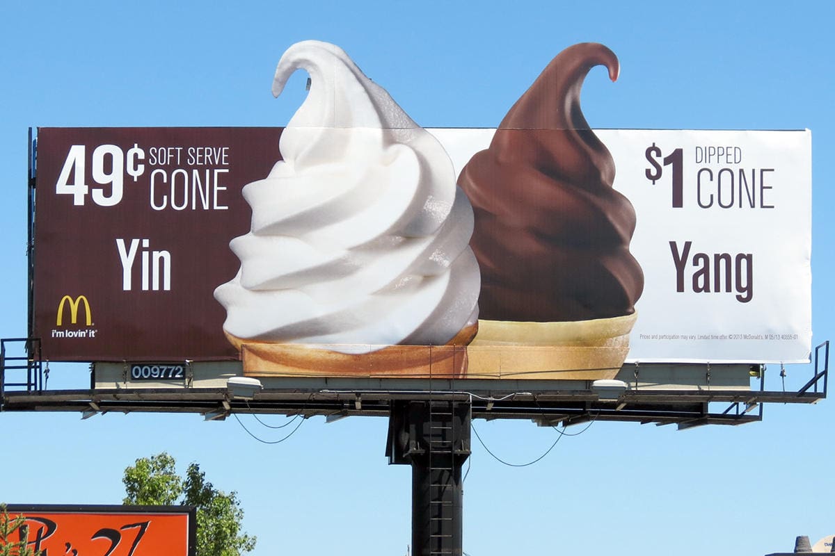
McDonalds Ice Cream
Rating: 3 (average)
- This week we’re looking at another billboard from McDonald’s. This board prominently features two ice cream cones, one vanilla and one chocolate, extending above and below the board. The organic shapes and extensions catch the eye and draw it into the ad.
- The background colors of brown and white echo the ice cream flavors while contrasting very well with the photography. But the selling message is muddied: there are items for sale and the text explaining them is difficult to read. It would be easy for the target market to think vanilla is 49¢ and chocolate is $1. Yes, there are two flavors and two ice cream cones, and they’re yin and yang, but why is chocolate twice as much?
- And then the eye has sweep across the ad again to figure out who is selling these weirdly priced cones because the tiny logo is in the lower left instead of the lower right where the brain expects to find it.
- One selling message is best, but sometimes advertisers refuse to do that, and you have to remember who’s buying the ad space. If you use a small logo put it where it’s easy to find.
- This board manages to fumble away a higher rating and earns a 3 (average).
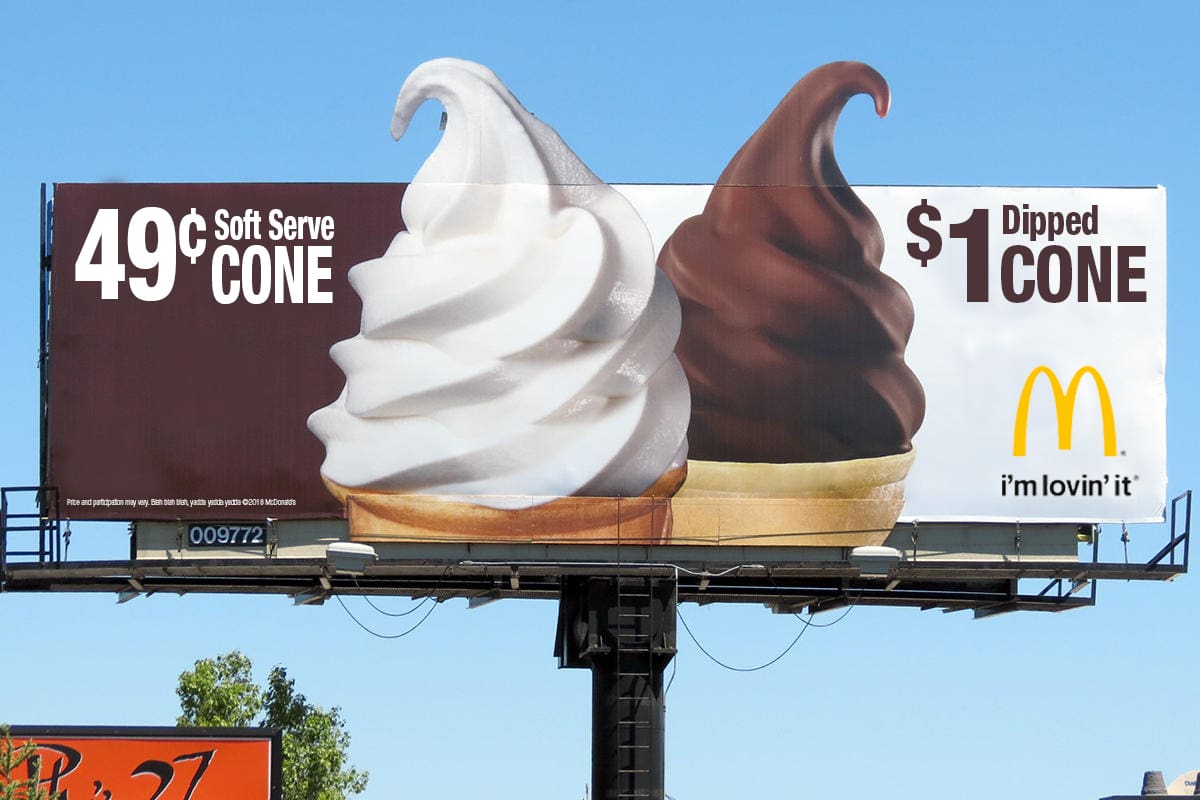
Given the opportunity, I would encourage the advertiser to step away from the cute stuff in favor of making sure the ad clearly communicates the selling message and keep it simple. The Yin and Yang text gets in the way of selling ice cream cones, so let’s leave it out and make the text legible and the advertiser obvious, and we’ll keep that negative space McDonald’s likes (bless them!). See below:
[wpforms id=”9787″]
Paid Advertisement


100% Agree with this rating and for the reasons stated. Your recommended revision looks great.