


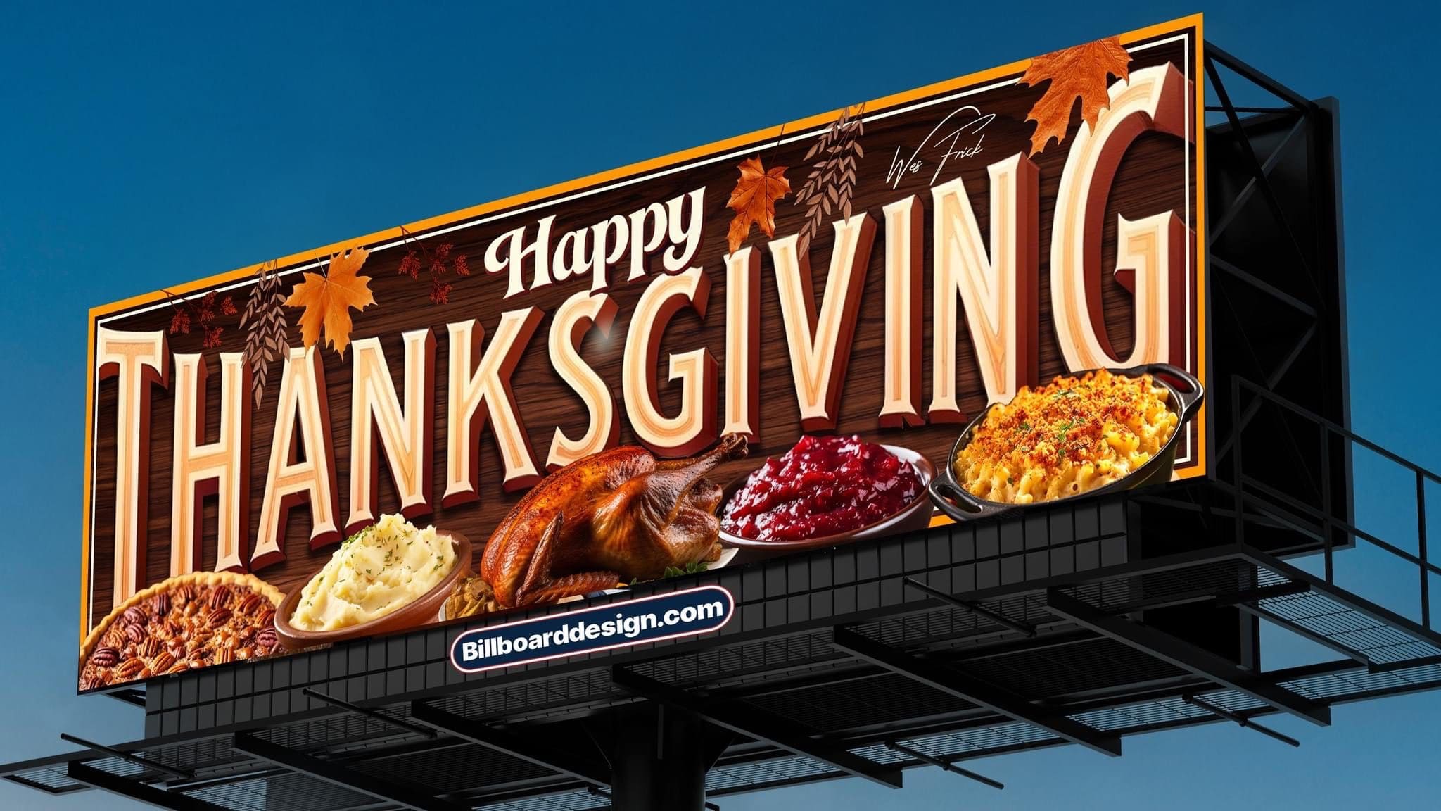
Rate This Ad allows a billboard designer to rate a random billboard ad using the following scale: 1 (not good), 2 (below average), 3 (average), 4 (very good), 5 (great). Then the designer talks about what they may have done differently for outdoor advertising. This week’s rating is provided by Wes Frick of Wes Frick Design.
This Thanksgiving Lamar, Clear Channel, and Adams put out some great Thanksgiving self promos to brighten up the streets of their cities. Today, I’ll be rating billboards by category and giving some insight on the overall designs.
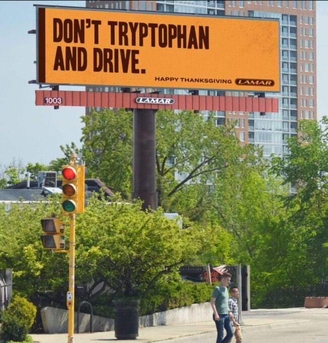
- This ad caught my eye pretty quickly because it has a very high contrast using a yellow background with brown letters, which also fits into the Thanksgiving theme well.
- The main headline “Don’t Tryptophan & Drive” is funny since that Thanksgiving Turkey makes you so tired.
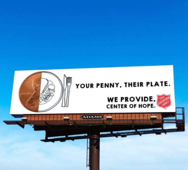
- Adams donated space to help The Salvation Army raise funds for those in need using a half penny & drawing of a plate, symbolizing a future meal for someone.
- Your penny, their plate makes it look easy to donate to the cause.
- A great billboard to help those in need.
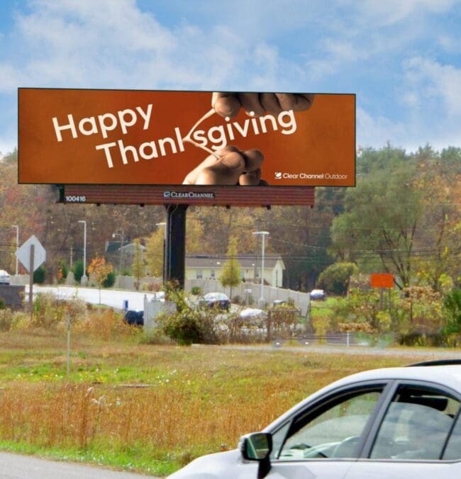
- This billboard makes a clever use of the letter K by using a wishbone.
- I like when it an idea goes over the whole canvas.
- I’d make it just a little bit bigger and add some golden yellow or more decoration on the sides, but it’s still a great billboard.
To receive a free morning newsletter with each day’s Billboard insider articles email info@billboardinsider.com with the word “Subscribe” in the title. Our newsletter is free and we don’t sell our subscriber list.
Paid Advertisement


It took me a few seconds to recognize the hands were hands on the Clear Channel creative. I hope it was easier to see in person than in the photo. Different lighting on the hands might have helped.