


Rate This Ad allows a billboard designer to rate a random piece of billboard artwork using the following scale: 1 (not good), 2 (below average), 3 (average), 4 (very good), 5 (great). Then the designer talks about what they may have done differently for outdoor advertising. This week’s rating is provided by Greg Callaham www.gregcallaham.com) who has over 30 years of experience in outdoor advertising design. Insider has used and endorses Callaham’s services.
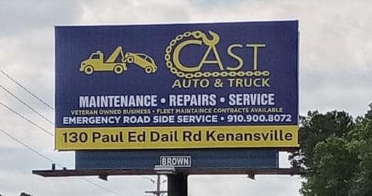
Cast Auto and Truck
Rating: 2 (Below Average)
- Twenty-five. That’s how many words are in this ad. That’s thirteen to eighteen words too many for an effective outdoor ad at this size.
- The graphic of the tow truck and car is a bit small for it to effectively communicate what the highly stylized logo says. The next three words read well and the next thing that reads is the directional. Everything in between is too small and too cluttered to convey the information therein. Part of that is contact info and that’s not good.
- This ad earns a 2 (below average)
As always, I do not know the details of the art request or components of the campaign this ad may or may not have been part of. But looking at this challenge with the eye of an OOH graphic designer and through the lens of the target audience, I would have urged the advertiser to run the ad pictured below:

- The color scheme is the same, but the selling message has been simplified for easier reading by the target audience.
- The tow truck graphic is larger and so is the logo, making both easier to read and understand.
- The text is edited down to the main features and benefits while the contact info is simplified to a larger phone number.
- The advertiser does not have a web site, but their Facebook page appears to serve that purpose, so I added the Facebook icon.
To receive a free morning newsletter with each day’s Billboard insider articles email info@billboardinsider.com with the word “Subscribe” in the title. Our newsletter is free and we don’t sell our subscriber list.
Paid Advertisement


He just made the same thing lol
I disagree, Chris A. The colors may be the same and the design similar, but it’s a major improvement in terms of readability. As a media buyer, readability is the #1 concern to me. Without it, the media dollars I’m spending are being wasted. The thing that surprised me is that this company has no website. It doesn’t have to be much, but there needs to be one… even if it’s a single page listing contact info and services offered with a link to Facebook for more info and Q&As.
Towing (the clip art logo)
Maintenance
Repairs
Service
Fleets
Emergency roadside
To me the whole thing screams “we’re desperate for any kind of business”.
I’d question whether they should even be on a billboard in the first place. Are they hoping someone breaks down right in front of the sign? Do they think people are going to pull over and write the number down in case they’re ever in a jam? How many people driving past the sign per day are in a position to hire someone for fleet maintenance?
Seems like a classic situation for SEO- oh but they don’t have a website lol. I think both the before and after billboards are totally worthless, despite the artist’s obvious attempt to whittle things down for the client, who I could imagine was a pleasure to work with.