


Rate This Ad allows a billboard designer to rate a random piece of billboard artwork using the following scale: 1 (not good), 2 (below average), 3 (average), 4 (very good), 5 (great). Then the designer talks about what they may have done differently for outdoor advertising. This week’s rating is provided by Greg Callaham (www.gregcallaham.com) who has over 30 years of experience in outdoor advertising design. Insider has used and endorses Callaham’s services.
McDonalds
Rating: 3 (average)
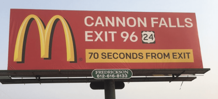
- McDonald’s billboards have to meet certain branding standards dictated by corporate so there isn’t much room for creativity.
- Whoever designed this ad found a way to be creative with the directional. By positioning the proximity to the exit in time, the most valuable thing known to humans, the implication to the target audience is that the McDonald’s is closer than a competitor that is a half mile down the road. It almost gets the prospect to commit to the golden arches before they even get off the road.
- I would have used bolder text and made either headline or the directional upper and lowercase to break up some of the “sameness”.
- I also would have deleted the Route 24 guide sign, just to avoid any unpleasant conversations with the authorities about it appearing on a billboard.
- Overall, this ad earns a 3 (average).
[wpforms id=”9787″]
Paid Advertisement


I’d rate it a 4. Simple, informative and readable
copy.