


Rate This Ad allows a billboard designer to rate a random piece of billboard artwork using the following scale: 1 (not good), 2 (below average), 3 (average), 4 (very good), 5 (great). Then the designer talks about what they may have done differently. This week’s rater is Greg Callaham www.gregcallaham.com) who has 30 years of experience in outdoor advertising design. Insider uses and endorses Callaham’s services.
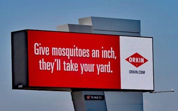
Give Mosquitos an Inch
Rating: 4 (very good)
- It’s hard to argue with the K.I.S.S. principle – Keep It Super Simple. This Orkin ad does an admirable job of drawing the eye and turning a clever phrase while keeping it very simple.
- The red background attracts attention and reinforces the Orkin branding.
- The play off the common phrase “Give ‘em an inch and they’ll take a mile” makes a memorable tagline about a ubiquitous outdoor pest stick firmly in the brain.
- The red logo on a white field makes it very clear who is sending this message to the target audience.
- The eye barely moves as it takes in the entire message in about 4 seconds, making for a fast, easy read.
- There’s a lot to love with this board, but in the spirit of continuous improvement, I would have used a slightly bolder font in the tag line for a little more “oomph” and I would have enlarged the web address for increased legibility.
- This ad earns a solid 4 (very good).
[wpforms id=”9787″]
Paid Advertisement


Dave, do you agree with the suggestion that they should enlarge the website address? Personally, I don’t think it’s a good idea to include phone numbers, addresses, websites, or directions in creative anymore. Everyone has a smartphone today and if they ad catches their attention they can get all that information by saying, “hey Google…”
I’d rate this ad 5-stars, especially if they remove the website address.