


Rate This Ad allows a billboard designer to rate a random piece of billboard artwork using the following scale: 1 (not good), 2 (below average), 3 (average), 4 (very good), 5 (great). Then the designer talks about what they may have done differently for outdoor advertising. This week’s rating is provided by Greg Callaham (www.gregcallaham.com) who has 30 years of experience in outdoor advertising design. Insider has used and endorses Callaham’s services.
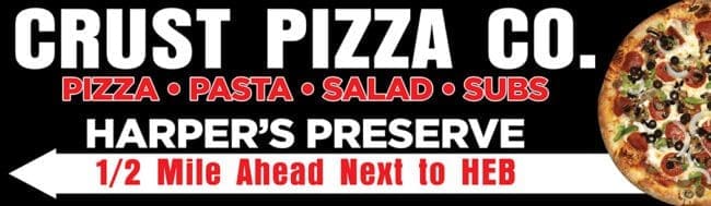
Original Crust Pizza
Rating: 2 (below average)

- This pizza ad is scrambled and has too many words. There are eighteen, plus seven more in the logo.
- You can’t read the logo. So, the target audience knows it’s a pizza ad, but doesn’t know which pizza restaurant.
- It kind of looks like Harper’s Preserve is the business name, but that’s the location of the strip mall where the pizza restaurant is located. The very small thin directional does not clarify any of this confusion.
- The next chunk of ad space is chopped up vertically, sending the eye bouncing in a completely different direction as it tries to read the three options for obtaining pizza.
- Finally, the additional offerings and web address are too small to read and positioned where the eye is desperately seeking directional help. This ad gets a 2 (below average).
As always, I do not know the particulars of the art request or components of the campaign this ad may or may not have been part of. But looking at this challenge with the eye of an OOH graphic designer and through the lens of the target audience, I would have urged the advertiser to run the ad pictured below:
The business name is large and clearly legible, the additional offerings support the implications of what the target audience can expect to eat there. The directional is also large and positioned on two lines exactly where the eye expects it to be. The word count is still a tad high, but it’s still ten less than the original ad and conveys the same selling message.
[wpforms id=”9787″]
Paid advertisement


Hi! This billboard is in my neck of the woods. I appreciate the “Rate This Ad” columns that come out periodically and was excited to see a billboard that I have seen in real life!
I just wanted to drop a note that the original ad is much more “on-brand” for this pizza place. Crust Pizza does not compete with your Papa Johns or Pizza Hut chains. It is more of a Grimaldi’s style place. The stylistic choices in the original ad reflected a slightly more upscale dining experience. Their logo, on the left of the display, is enough for locals to know exactly what the business is. I would not recognize the revised billboard as advertising the same restaurant.
If the original ad is too wordy, the first thing I would cut would be the dining options. Everyone knows you can dine in or carry out. I actually did not know about the delivery option, but that does not surprise me, given the pandemic. A lot of restaurants have brought in that service. Other than that, I would not change much in the original display.
Thanks for showcasing this ad! Keep it up!