


Rate This Ad allows a billboard designer to rate a random piece of billboard artwork using the following scale: 1 (not good), 2 (below average), 3 (average), 4 (very good), 5 (great). Then the designer talks about what they may have done differently for outdoor advertising. This week’s rating is provided by Greg Callaham www.gregcallaham.com) who has 30 years of experience in outdoor advertising design. Insider uses and endorses Callaham’s services.
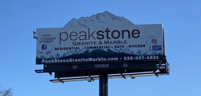
Peakstone Granite and Marble
Rating: 3 (average)
- This ad features a great use of extensions to attract attention and a large logo/business name to drive home who is advertising. After that things seem to go downhill.
- The bulleted copy line is too bold and too small, as is the contact info across the bottom.
- The mish mash of social media and BBB logos bracketing the logo is confusing and effectively camouflages the street address, which is already too small and thin to read.
- The content should be simplified and more focused. This billboard earns a 3 (average).
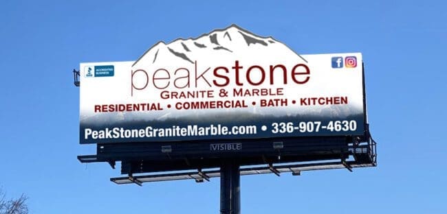
As always, I do not know the particulars of the art request or components of the campaign this ad may or may not have been part of. But looking at this challenge with the eye of an OOH graphic designer and through the lens of the target audience, I would have urged the advertiser to run the ad pictured below:
[wpforms id=”9787″]
Paid Advertisement


With just 3-5 seconds of reading time at highway speeds, that phone number (10 words long) eats 2-3 seconds of precious comprehension. People read at 5 words per second on average, so the viewer can only digest 15-25 words on a sign. Icons like social media and BBB logos each act as a 2-3 words (and they fracture the thought continuity of the ad by directing the viewer elsewhere). If you speak the ad content aloud to yourself, you can gather a good idea of the time constraints of the message.
Designers and sales staff should educate clients that OOH is best used as a brand-building medium with messages under 10 words total. As such, all this sign needed was the logo, name and web address to be memorable.