


Rate This Ad allows a billboard designer to rate an out of home ad using the following scale: 1 (not good), 2 (below average), 3 (average), 4 (very good), 5 (great). Then the designer suggests improvements. This week’s rating is provided by Greg Callaham www.gregcallaham.com) who has 30 years of experience in outdoor advertising design. Insider uses and endorses Callaham’s services.
In-N-Out Burger
Rating: 1 (not good)
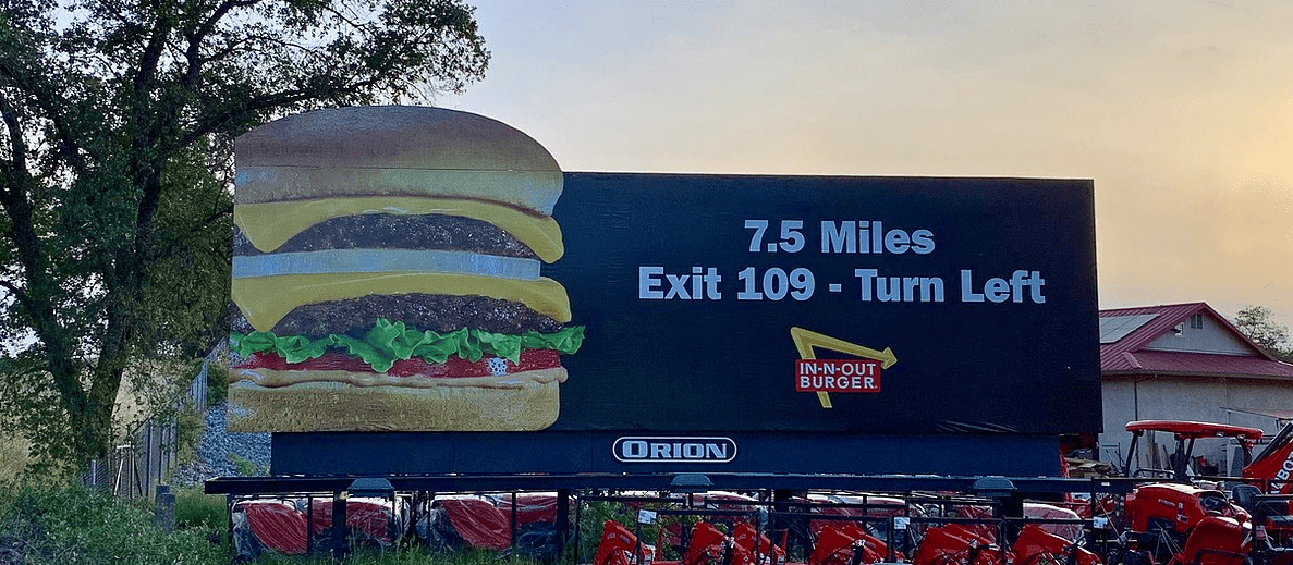
- The first thing I see is the left edge of the burger and it’s hard to stop looking at it. Why is there a weird-looking straight edge on the left side of the food we’re trying to sell? It’s a distraction that works against making the product look appealing. I suspect it was the photography provided by the advertiser, or perhaps not provided and this was the photo found online.
- This is an ad for food, so the photo of the food should look good and make the target audience want it, not wonder what’s wrong with it. The other two elements of the design do not offset the strangeness of the photo. The directional positioned as the headline causes you to take a second look before you realize that’s what it is. We don’t have time for that.
- And the small logo is difficult to read and needs more contrast with the black background. That adds up to a 1 (not good).
As always, I do not know the particulars of the art request or components of the campaign this ad may or may not have been part of. But looking at this challenge with the eye of an OOH graphic designer and through the lens of the target audience, I would have urged the advertiser to run the ad pictured below:
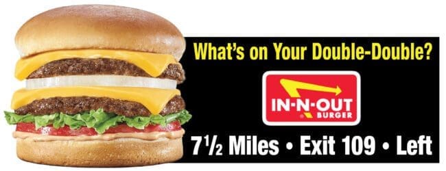
The more natural left edge of the burger not only helps catch the eye, but also makes the mouth water. The headline engages the viewer using text from the company web site. A different, larger logo pops off the black background better. And the directional is where the target audience expects it and it’s more memorable because it’s the last thing on the ad they see.
[wpforms id=”9787″]
Paid Advertisement


Commenting on the Billboard Ad—-In and out Burger; Always try to remember the 5 “W’s” of Journalism: Who, What, Where, When, and Why. Also the KISS formula !!! If you don’t accomplish this is in your art work representations, “you have failed the customer.” Very important that the name of the business is center of the artwork expression. Most agencies are not familiar with the Letter chart readability sizes for block or spur type fonts. Directional copy usually large and should read: EXIT 109 – LEFT 7 MI.; feedback from customers about that 1/2 mile will also let you know (they are reading the Billboard) that’s what you want. “Been there -done that!! ” 47 years of sales and art presentations.