


Rate This Board allows a billboard designer to rate a random piece of billboard artwork using the following scale: 1 (not good), 2 (below average), 3 (average), 4 (very good), 5 (great). Then the designer talks about what they may have done differently for outdoor advertising. This week’s rating is provided by Greg Callaham www.gregcallaham.com) who has 30 years of experience in outdoor advertising design. Insider has used and endorses Callaham’s services.
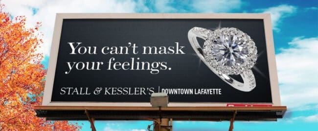
Stall & Kessler’s
Rating: 3 (average)
- Jewelry ads are more common this time of year. This ad is a very good example of how to keep it simple and effective, and also a common pitfall to avoid.
- The eye-catching photo of the sparkling diamond ring does the job of selling the sizzle.
- The tag line cleverly unites a centuries-old phrase with a current event in a memorable fashion.
- And then we’re left wondering who the advertiser is. This is a challenge with “high end” advertisers. Sometimes jewelry stores run stock ads from manufacturers and sometimes they have a style in their other advertising, and they want to maintain it in the Outdoor ad messaging. We have to convince them to be flexible and trust us to maintain their “look and feel” while making sure the target audience sees their name. In this example, a terrific ad stumbles where it’s most critical: the advertiser’s name and location. That hobbles its effectiveness and negatively affects the advertiser’s ROI. This ad earns a 3 (average) instead of a 4 or 5.
As always, I do not know the particulars of the art request or components of the campaign this ad may or may not have been part of. But looking at this challenge with the eye of an OOH graphic designer and through the lens of the target audience, I would have urged the advertiser to run the ad pictured below.

[wpforms id=”9787″]
Paid Advertisement


I like the copy and I would rate it as very good.
I like how the product (diamond), name of
store and location was featured. I also liked
the contrast of color i.e. white on black. Good
contrast, makes for a good read.