


Rate This Ad allows a billboard designer to rate a random piece of billboard artwork using the following scale: 1 (not good), 2 (below average), 3 (average), 4 (very good), 5 (great). Then the designer talks about what they may have done differently for outdoor advertising. This week’s rating is provided by Greg Callaham (www.gregcallaham.com) who has over 30 years of experience in outdoor advertising design. Insider uses and endorses Callaham’s services.
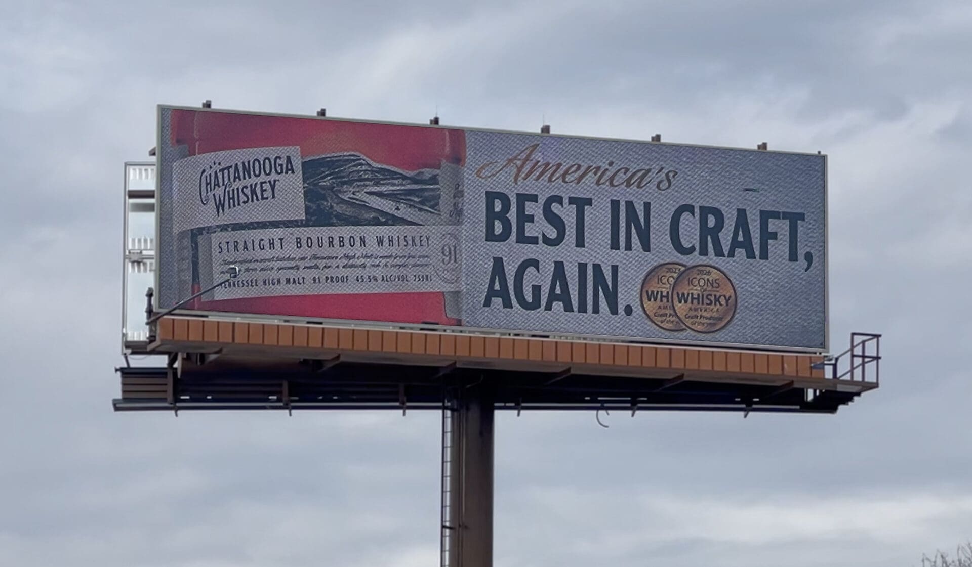
Chattanooga Whiskey
Rating: 2 (below average)
- This ad for a distillery is a bit difficult to figure out at first glance. That’s a problem.
- The reddish color, the white background, the gold script, and black text made me think it was a Budweiser ad. It’s not.
- Since the average read time for our industry is about seven seconds, advertisers don’t have time to send the target audience in the wrong direction and hope they figure out the selling message by the end of the read or one of the next times they see the ad.
- Using the product hero shot to show the logo is a good idea if it works. In this case the logo is too small. It’s also distorted, hurting its legibility even more. A
- nd that logo is the only thing that tells the viewer what won the award that’s bragged about. This ad earns a 2 (below average).
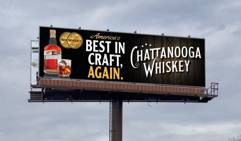
As always, I do not know the details of the art request or components of the campaign this ad may or may not have been part of. But looking at this challenge with the eye of an OOH graphic designer and through the lens of the target audience, I would have urged the advertiser to run the ad pictured below to promote the same message:
To receive a free morning newsletter with each day’s Billboard insider articles email info@billboardinsider.com with the word “Subscribe” in the title. Our newsletter is free and we don’t sell our subscriber list.


Noticed the liquor advertising sketch with before and after sketches. My landowners have final approval of all advertising placed on their property. 50% chance this wouldn’t qualify for the billboard location. Have used this landowner permission on all my small market landowners for the last 22 years. Haven’t placed any advertising of this type and other local businesses have stepped up and filled the locations. Most of our small market advertising are directional type signs. These keep renting and renting and renting–never a blank location. Local pays better without commissions to others. More net profit to the smaller business.