To keep focused, Insider thinks you should spend 15-20 minutes each morning looking at covid-19 data and then tune out the talking heads and do your work. Here’s where to find the best data.
The Institute for Health Metrics and Evaluation at the University of Washington runs a projection for hospital resource use related to covid-19 by state and for the US. The White House refers to this forecast in its briefings. Look up the projection for your state to see if the worst is still to come or if you’re past the worst. Insider lives in Washington State which was an early hotspot but also an early social distancer. The state is 4 days past peak hospital resource use related to covid-19. Bet you haven’t seen that in the gloom and doom headlines. There is no shortage of hospital beds or ventilators. That’s why Washington sent 400 ventilators to the state of New York. Social distancing works.
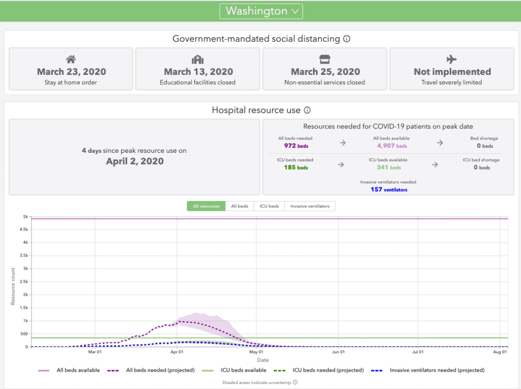
Source: covid19.healthdata.org/projections
The US is 9 days away from peak hospital covid-19 use as you can see below. Looks like social distancing will be needed through sometime in May.
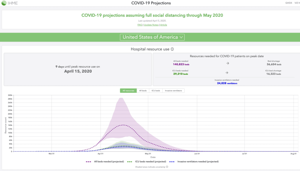
Source:covid19.healthdata.org/projections
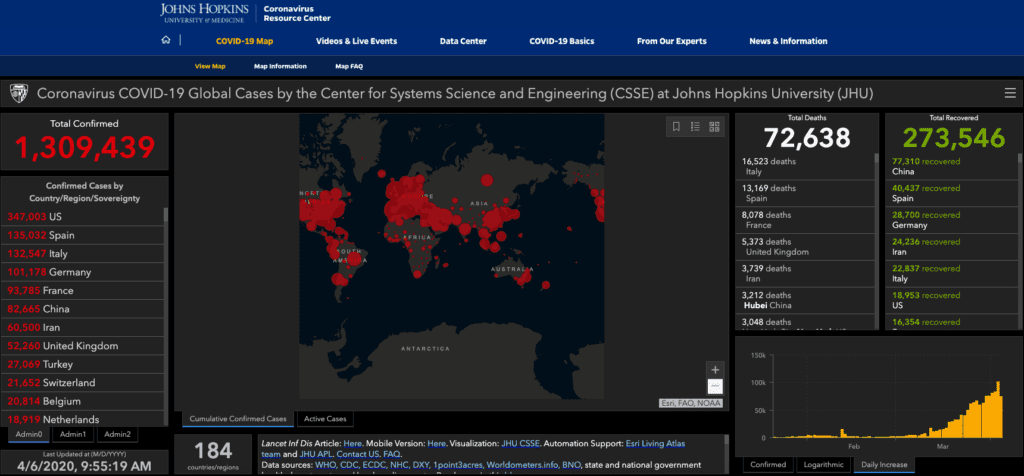
To see what’s going on in the world look at the John Hopkins covid-19 map. Insider focuses on the new cases chart in the lower right hand corner It tells you at a glance which countries have defeated the virus (South Korea, China), which countries are showing declining cases (Italy, Spain, Germany, Iran, Switzerland, Austria, ) and which countries are showing increased cases (US, UK, Sweden, Turkey, Netherlands, Canada).
Your state’s health department.
Your state’s health department will track coronavirus deaths, cases and tests. That’s the place to look for historic trends. You need to focus not just on new cases but also on new tests. If you test more for conoravirus you’ll find more cases.
[wpforms id=”9787″]
Paid Advertisement