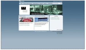
Earlier this year, Billboard Insider published five design tips for a great outdoor advertising website. Well, it seems like Melody Roberts at Out of Home Creative must have read our article. Her Atlanta-based design firm recently worked with one of Atlanta’s premier out of home and billboard advertising companies, Whiteway Outdoor Advertising, to redesign their website (whitewayoutdoor.com). You can see the impact of good website design on these before and after pictures of Whiteway’s website.

Whiteway Outdoor website before redesign:
- Non-responsive theme
- Not mobile optimized
- No sign map or inventory images.
- Small sub-sections confuse and distract.
![After[2]](https://b1600334.smushcdn.com/1600334/wp-content/uploads/2016/07/After2-300x175.jpg?lossy=2&strip=1&webp=1) Whiteway Outdoor Website after redesign:
Whiteway Outdoor Website after redesign:
- Responsive theme.
- Clear readable page.
- Mobile and tablet optimized.
To read the details of the website redesign, visit Out of Home Creative’s outdoor advertising blog.


