By Chris Cowlbeck
 Some people know a font as a stone receptacle full of water used in baptisms at churches. Before computers, most folks had no idea what a font in design might have been, not to mention what a good one was.
Fonts are used in typesetting in the print world, and for our computer designs for billboards, the programs display the letters in different sizes and styles….these are the fonts with our immediate interest, although the other ones have a great importance too!
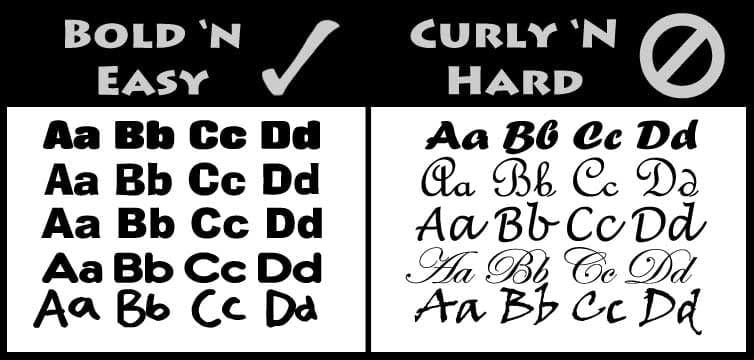
Bigger bolder letters will be easier to see, right? Not necessarily. See the first line in the chart below. The curly font is bold, but harder to read. The style and shape of the letter will determine how easily it is for the eye to comprehend. And for us, the easier it is for the LOOKer to “see” it quickly, means there’s more time for them the “get” the message. Over the years I have tended to grab several great fonts, but as the internet has flourished, availability of different fonts is about as plentiful as the number of leaves on a tree.
This chart is an introduction to some simple variations of some Bold ‘N Easy fonts on the left and some Curly ‘N Hard fonts to the right. Notice that they look fine on your screen just now, although it’s easy to see the ones to the left first. See if you can find some junk mail, flyers or business cards on your desk that have the curly fonts on them and notice upon picking them up that you can move them in and out with your hands to focus on them to be read. Now step back 20 or 30 feet or zoom out on your screen, or print it out and take the chart below down the hall. Notice how the ones on the right seem to disappear? Not good for billboards at all and many times, the simple design selection dooms a campaign to failure. So if you want successful layouts and effective message delivery, focus on your font selection.

 Chris Cowlbeck is a busy guy. He runs Look Billboards a rural Oklahoma out of home company as well as the IBOUSA. In his spare time Chris trains bird dogs and blogs on billboard ad design at his company’s website. Insider running a series with Cowlbeck’s thoughts on out of home ad design.
Paid Ad


