This week’s design tips from from Wilkins Media, the OOH and experiential experts. This article originally appeared in the Wilkins Media Blog. Insider thanks Josh Friedman for permission to republish.
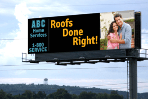 OOH creative requires a special art. Executing strong OOH creative means take into account certain specifics such as distance to the road, angle of the space, height of the unit, and length of time of visibility. Creative should be matched to the specifics of each OOH media unit purchased to optimize results.
Stick with one idea or concept. Get one point across. When you try to do to many things with one billboard your intent gets lost and your billboard gets forgotten.
Lead with your logo. When consumers are driving by your billboard and they only get to see one thing, the place all people start reading from is the upper left corner. Place your logo there.
Use an image. Make sure your image is relevant to your headline and expresses an emotion. You want people to feel something when viewing your billboard so using an image that plays well with your headline and makes an emotional connection will assist your audience in remembering your billboard.
Create a high contrast design. My preference is to use a dark background color with light colored text. The dark background will absorb the surrounding light allowing the light colored text to pop off the billboard.
Remember… High Contrast = High Visibility = High Readability = High Memorability.
Use 7 words or fewer. Use the fewest amount of words possible. The easier your copy is to read and comprehend the more likely your audience will retain your message and take action.
[wpforms id=”9787″]
Paid Advertisement
