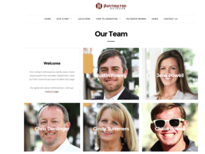
Insider will release the 2017 out of home website rankings next month. Here are three out of home website design flaws Insider has noticed while compiling the rankings.
 No staff pictures or names. Only 19% of the out of home websites in Insider’s database contain staff names and pictures. Why not give potential clients info on who to call? Huntington Outdoor does it right (see photo on right). You can see the names and pictures or the people you want to talk to and even a short video of Justin Powell and Jena Powell. This is way more effective than the sales@outdoorcompany.com or info@outdoorcompany.com which Insider usually sees.
Failing to mobile-optimize. More than half of all web searches are on smart phones, but only 49% of the out of home websites in Insider’s database are mobile-optimized. If you don’t mobile optimize your site, you are writing off half the people who want to access your site. Make it easy for someone who’s looking at your sign to search your website for more info. See Mobile-Optimize Your Out of Home Website for more info.
Using adobe flash. If you use adobe flash on your website’s splash page nothing happens on an iphone. Iphones don’t read flash. Insitemediacom.com has a website with lots of great sign info, pictures and maps, but here’s how the site’s landing page looks on Insider’s iphone. Easy to overlook the tiny [enter] button in the upper right hand corner which you need to press to enter the website.

Paid Ad


