 With permission from One Agency
We all know the bonuses to advertising using OOH…tapping into the unconscious psychology of a geo-targeted group of consumers is a huge one, because your tactically selected audience has minimal control over the information that they digest in their day to day lives.
We’ll admit, at One Agency we class ourselves as out of home geeks. We love finding new ways to tap into the psychology of the consumer to figure out how they like to ingest information; because this goes so far beyond simply showcasing the facts that you consider to be most interesting within your business. Factors like the way that the eye moves across different formats, the colors and the types of images that work best in different environments are determiners of how much traction any outdoor ad generates.
In this blog we’d like to chat to you about some of the factors that we consider to be most interesting when delving into the psychology behind billboard advertisement consumption, particularly, and how best to maximise your potential traction depending on dwell time.
Why billboard advertising actually works
It’s fundamentally important to remember that people don’t like to be advertised to. This is why the most successful advertisement campaigns disguise themselves as experiences; by appealing to some human emotion.
When considering advertising options, brands are often keen to occupy advertising spaces that are pushed to the front of a consumer’s mind – like mobile pop up ads – unknowing that sometimes it’s actually preferable to dominate the space outside of your consumer’s immediate attention. For example, when a consumer is watching a YouTube video with a mandatory 5 second watch time before a skip button appears, the vast majority of times we see that the consumer is watching the countdown to when they can skip the ad, completely ignoring the content that they are being served with.
However, when a consumer is driving to work and they are stuck in a traffic jam, they are likely to read the content displayed on a large billboard voluntarily, for want of amusement. These assertions lead to the inevitable truth that creatives must be manipulated to maximise success with the intricacies of each varying format in mind.
We are by no means asserting that YouTube advertisements are completely ineffective; simply that due care is needed to tailor advertisements to this format to ensure that they optimise people’s attention spans in each format.
How do people see billboards?
Common sense states that too much text on a billboard dissuades anyone from reading any of it, and that colors that blend in with the billboard’s geography won’t be noticed.
But the science of the way in which we interpret billboards goes much further than this. The eye has a predetermined method of perceiving billboards, which must be considered when constructing billboard creatives: The human eye naturally moves across posters in a Z shaped line – which means that creatives that are formulated with content situated at the top, middle and bottom are consumed better than those with content scattered around.
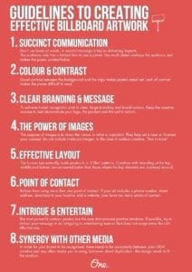
We know that people aren’t likely to read large bodies of information whilst on the go. But often advertisers seem unaware that the ideal word count for billboard content is actually seven words. It can be tempting to try to utilise the space to convey too much information, but this confuses your message and makes the ad unidentifiable.
Ultimately, the purpose of billboard advertising is to engrain your branding into the consciousness of the public, so that when they think of a product or a service, they think of your brand.
The best way to do this is through a succinct brand message, a call to action, and some imagery with an element of depth that allows for a strong and distinct focal point, as this is how the eye is drawn to the creative in the first place.
We’ve compiled a nifty checklist of ways to be sure that your billboard creative is as effective as it can possibly be.

[wpforms id=”9787″]
Paid Advertisement


