 Rate This Board allows a billboard designer to rate a random piece of billboard artwork using the following scale:
- 5 Great
- 4 Very Good
- 3 Average
- 2 Below Average
- 1 Poor
Then the designer talks about what they may have done differently for outdoor advertising. Melody Roberts of Out of Home Creative rates this week’s art.
Billboard Design: Reis-Nichols
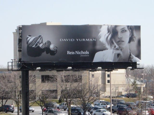
Rating: 3 Average
- Clean, elegant, product focused branding ad. The main issue I see is the “jeweler” could be mistaken as a featured designer under the David Yurman brand vs the merchant that sells it.
- It’s likely that this is a corporate template and they didn’t have a choice for size and placement but I would have made the “jeweler” copy twice the size and bolded it under Reis-Nichols.
- If you don’t know that Reis-Nichols is a retail jewelry store, then you might not understand the message of the billboard. Reis-Nichols could possibly be paying for another merchant who sells David Yurman to get his business vs concentrating on his own ROI.
- Even though I like the overall concept, the color scheme is a little washed out. On an overcast day this visual could wash and I don’t think it could work in any other location than surface street. If the location was an interstate board, I would advise to go with a more contrasting color scheme (even Black and White vs Grayscale) leave the model out and enlarge product and logo.
Paid Advertisement
