 Insider is starting a new feature called Rate This Board in which we ask a billboard designer to rate a random billboard using the following scale:
- 5 Great
- 4 Very Good
- 3 Average
- 2 Below Average
- 1 Poor
Then the designer talks about what they may have done differently for outdoor advertising. Melody Roberts, Owner and Principal Designer at Out of Home Creative rates this weeks billboard art. We’ve interviewed Melody before on Using Creative as a Sales Tool and on QR Codes and Billboards.
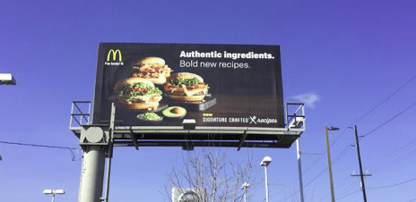
Design: McDonald’s

Rating: 4 (very good)
Like many fast food categories, posters are normally used for price point or new products as shown here. Their agency knows how to keep it simple for outdoor advertising. In this particular billboard, the advertiser didn’t use their signature colors, instead choosing Black to visually define the “bold” new recipe. I believe they may have wrapped – or added a treatment – to the poster frame in Black to make the black background that much deeper. They practice what I preach, “just because you have the space, doesn’t mean you have to fill it”. However, I think they could have made the sandwiches and copy a little larger, being a street surface board they can get away with this. Generally, people read Left to Right so I would have reversed this layout. Great location in a dealership parking lot for traffic going in and out!
Paid Advertisement


