


Rate This Ad allows a billboard designer to rate a random billboard ad using the following scale: 1 (not good), 2 (below average), 3 (average), 4 (very good), 5 (great). Then the designer talks about what they may have done differently for outdoor advertising. This week’s rating is provided by Wes Frick of Wes Frick Design Agency.
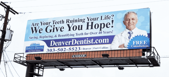
Denver Dentist
Rating: 1 (not good)
- The billboard currently has over 25 words, given the 2-3 second time period we have with out of home it’s currently broken.
- The fonts used overall are serif, which are more decorative and less legible. Serif fonts should be used sparingly, and only when simple.
- For this design, they’re pointing traffic to two different directions, the website and the phone number. The domain that they have is capable of major authority building and it should be much larger.
- The overall concept doesn’t represent the business well.
Because I feel the design is broken, I want to show a few other designs that I feel would be effective and worth it for Barotz Dental. Their domain is just so good, so I’m pitching an idea with extensions and then an idea with only the website. When a business has a domain this good, it should be the whole billboard and a reason why to go there.

[wpforms id=”9787″]
Paid Advertisement


