Rate This Board allows a billboard designer to rate a random piece of billboard artwork using the following scale: 1 (not good), 2 (below average), 3 (average), 4 (very good), 5 (great). Then the designer talks about what they may have done differently for outdoor advertising. This weeks rating is provided by Melody Roberts, an OBIE nominated billboard designer and founder of Out of Home Creative, an outdoor advertising design firm specializing in out of home design for businesses, agencies, media buyers and out of home companies. Melody has been in the outdoor industry since 1999.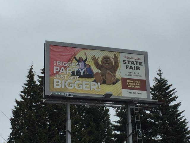
Washington State Fair
Rating: 2 (below average)
- Clients in this category generally want to use their own image(s) to show a ride or feature they have at their particular fair. However, I think a nice, clean, fun color with a vintage fair photo or graphic is enough to tell the public it is a fair.
- I think too much emphasis and real estate/space was used on the image.
- The wording on the Left is almost unreadable and I don’t believe it was even necessary. (White on top of a Yellow is a no, no… any light color combination on top of another is a no).
- The tier level of importance and what I would have made much, much larger is: State Fair, dates and website incase anyone wanted to find out more about location and hours of operation. As is, I don’t know where or when this State Fair is.
- This advertisement doesn’t have any vibrant contrasting colors and seems to run together.
Paid Ad
