Rate This Board allows a billboard designer to rate a billboard ad using the following scale: 1 (not good), 2 (below average), 3 (average), 4 (very good), 5 (great). Then the designer recommends how to improve the ad. This week’s rating is provided by Melody Roberts, an OBIE nominated billboard designer and founder of Out of Home Creative, an outdoor advertising design firm specializing in out of home design for businesses, agencies, media buyers and out of home companies. Melody has been in the outdoor industry since 1999. Insider uses and endorses her services.
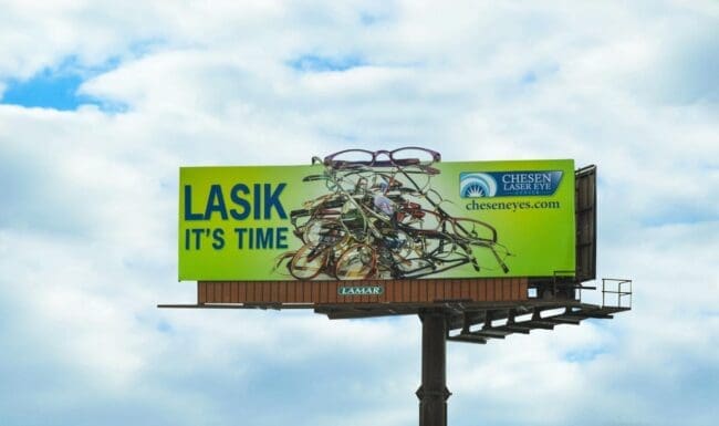
Chesen Laser Eye
Rating 3 (average)
Please Note: For all ratings, I don’t know if a client insisted on certain elements or how much experience the designer had with out of home advertising. My recommendations requested by Billboard Insider are solely based on how I would have approached the creative design.
- The visual is fun and good use of an extension.
- Alternative wording could have been, “TIME FOR LASIK” or “Stop the pile up with Lasik.”
- Blue and Green are on the same side of the color spectrum, so I would not have put them on top of each other (on a static billboard). Yellow is on the opposite side of the color wheel to Blue, and I would have suggested a gradient Yellow which would have been lighter behind the glasses and a little darker on the sides for the copy to stand out better.
- I don’t mind the logo being small, but the URL should have been more significant, so the public knows who the advertiser is and how to contact them.
[wpforms id=”9787″]
Paid Advertisement
