Rate This Board allows a billboard designer to rate a billboard ad using the following scale: 1 (not good), 2 (below average), 3 (average), 4 (very good), 5 (great). Then the designer recommends how to improve the ad. This week’s rating is provided by Melody Roberts, an OBIE nominated billboard designer and founder of Out of Home Creative, an outdoor advertising design firm specializing in out of home design for businesses, agencies, media buyers and out of home companies. Melody has been in the outdoor industry since 1999. Insider uses and endorses her services.

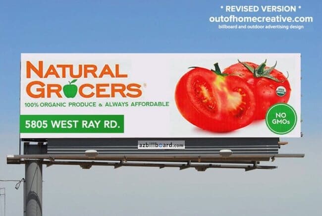
Natural Grocers
Rating 2 (below average)
Please Note: For all ratings, I don’t know if a client insisted on certain elements or how much experience the designer had with out of home advertising. My recommendations requested by Billboard Insider are solely based on how I would have approached the creative design.
- I like the simplicity of the advertisement, contrast is good, and I like the use of one image.
- There are several things I would have done differently to make this advertisement more effective. The circle on the Left is throwing the balance off, and the directions and logo are too small.
- I like White space on a billboard, but this feels like there’s wasted space. The advertiser will likely see more of a return just by making their elements larger, and by doing so, it will be easier for the public to view the Ad.
- If the board location is in “Chandler,” I would have recommended they take it off and make the address larger.
Below is my revised mock-up. I feel this revised layout offers balance and flow, and all the elements have more presence on the board.
[wpforms id=”9787″]
Paid Advertisement