


Rate This Board allows a billboard designer to rate a billboard ad using the following scale: 1 (not good), 2 (below average), 3 (average), 4 (very good), 5 (great). Then the designer recommends how to improve the ad. This week’s rating is provided by Melody Roberts, an OBIE nominated billboard designer and founder of Out of Home Creative, an outdoor advertising design firm specializing in out of home design for businesses, agencies, media buyers and out of home companies. Melody has been in the outdoor industry since 1999. Insider uses and endorses her services.
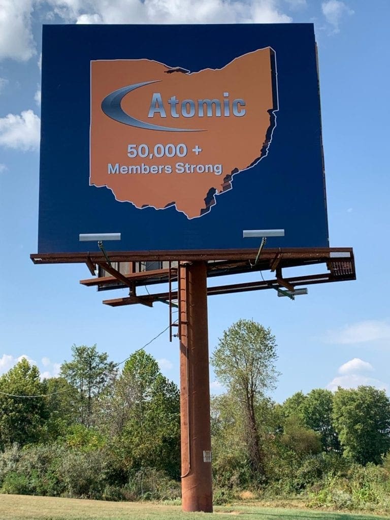
Atomic
Rating: 1 (below average)
Please Note: For all ratings, I don’t know if a client insisted on certain elements or how much experience the designer had with out of home advertising. My recommendations requested by Billboard Insider are solely based on how I would have approached the creative design.
- I don’t know if this board is an on-premise or if it was put up for an Association meeting.
- If it is placed randomly with this message, it would have helped if they put a few words or their URL so the public would know who they were because I Googled “Atomic,” and a lot of things came up.
A few recommendations I would have suggested:
- Change the board background to Orange and make the graphic Blue. This change would help the board stand out.
- Reverse the logo to White because the Silver gradient is hard to read against the Orange.
- Add either the website so the public could learn more about their Association or a couple of words referencing to what type of Association it is.
- Another idea; make “50K+ Members…” the full size of the graphic and put the logo and URL (or a few words) in White outside the graphic on the top or bottom.
[wpforms id=”9787″]
Paid Advertisement