


Rate This Board allows a billboard designer to rate a billboard ad using the following scale: 1 (not good), 2 (below average), 3 (average), 4 (very good), 5 (great). Then the designer recommends how to improve the ad. This week’s rating is provided by Melody Roberts, an OBIE nominated billboard designer and founder of Out of Home Creative, an outdoor advertising design firm specializing in out of home design for businesses, agencies, media buyers and out of home companies. Melody has been in the outdoor industry since 1999. Insider uses and endorses her services.
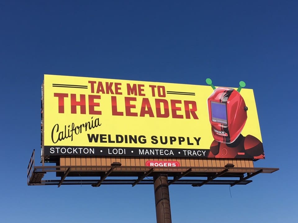
California Welding Supply
Rating 4 (very good)
Please Note: For all ratings, I don’t know if a client insisted on certain elements or how much experience the designer had with out of home advertising. My recommendations requested by Billboard Insider are solely based on how I would have approached the creative design.
This is a fun, eye-catching advertisement. The colors and fonts work well for OOH and the slogan with the Robot evokes a nostalgic reaction to the call to action. There are several things I would have done to tweak the layout:
- I would have moved the headline down and made it a little smaller; it looks too close to the top. Making this change would have allowed the Robot to be a more significant extension. If your client has the budget for an extension – give them one!
- “California Welding Supply,” this is one of those logos that does and doesn’t work for OOH. A simple modification to help close the gap in the middle would have been to rotate “California” down more or center it on top of ‘Welding Supply.’
- The locations are almost missed in the overall look, and they are crowded at the bottom. I believe this is geared towards commercial companies so I would have encouraged the client to leave the locations off and explain to them that potential customers can go online to learn more. If that were not an option, I would have made the font bolder and increased the size of the banner, so they weren’t so close to the logo. If they’d been able to tweak the logo per the above, this would have flowed better on the bottom half of the Ad.
[wpforms id=”9787″]
Paid Advertisement