Rate This Board allows a billboard designer to rate a billboard ad using the following scale: 1 (not good), 2 (below average), 3 (average), 4 (very good), 5 (great). Then the designer recommends how to improve the ad. This week’s rating is provided by Melody Roberts, an OBIE nominated billboard designer and founder of Out of Home Creative, an outdoor advertising design firm specializing in out of home design for businesses, agencies, media buyers and out of home companies. Melody has been in the outdoor industry since 1999. Insider uses and endorses her services.

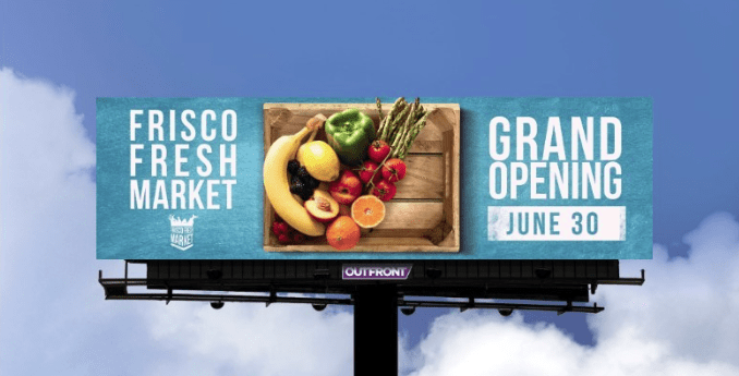
Frisco Fresh Market
Rating 4 (very good)
- Overall, this is a nicely designed example of a billboard advertisement.
- I’m not fond of using Blues as backgrounds on bulletins because as you can see here, it can wash against the blue sky; therefore, I sometimes ask for a location shot to see if there’s trees behind the billboard and if so, I’ll use Blue then. I would have recommended either the Teal be darker or another color such as Green which makes me immediately think of fruits and vegetables.
- The image is clear as to what it is, and I’m left to assume the artist wanted to contain each box of content, but I would have taken that opportunity to make the image stand out more. Another idea would have been to crop the cutting board on the right and enlarge the whole image by bleeding it into the live area. If the client would have approved an extension, the asparagus and pepper extending off the top would enhance the ad more.
- The wording is very close together so if the board is low it would be OK but if it is on an interstate I’m not sure how legible it would be.
- I’m left to wonder where the store is opening but consumers can Google nearby locations
[wpforms id=”9787″]
Paid Advertisement


