Rate This Board allows a billboard designer to rate a billboard ad using the following scale: 1 (not good), 2 (below average), 3 (average), 4 (very good), 5 (great). Then the designer makes recommendations on how to improve the ad. This week’s rating is provided by Melody Roberts, an OBIE nominated billboard designer and founder of Out of Home Creative, an outdoor advertising design firm specializing in out of home design for businesses, agencies, media buyers and out of home companies. Melody has been in the outdoor industry since 1999. Insider uses and endorses her services.
99
Rating 2 (Below Average)
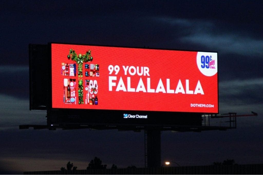
- The color contrast and font are good choices for OOH. I liked that the advertiser used a seasonal tagline to engage the public and pique interest. Besides that, I have no idea who the advertiser is.
- I don’t believe motorists would be able to read the website or make out the full company logo.
- The image of the present is made up of items the advertiser sells but again, I doubt that is visible as to what they are from the highway.
- I only have this visual to go by so I don’t know if they utilized digital correctly by showcasing individuals items per flip which is the direction I would have encouraged the client to go in after they used this visual.
- I would have recommended the website and logo be more substantial and as well as the graphic moved to the Right for a natural flow.
[wpforms id=”9787″]
Paid Advertisement
