Rate This Board allows a billboard designer to rate a random piece of billboard artwork using the following scale: 1 (not good), 2 (below average), 3 (average), 4 (very good), 5 (great). Then the designer talks about what they may have done differently for outdoor advertising. This weeks rating is provided by Melody Roberts. Melody Roberts is a billboard designer and founder of Out of Home Creative, an outdoor advertising agency specializing in creating unique out of home designs for businesses, agencies, media buyers and out of home companies.

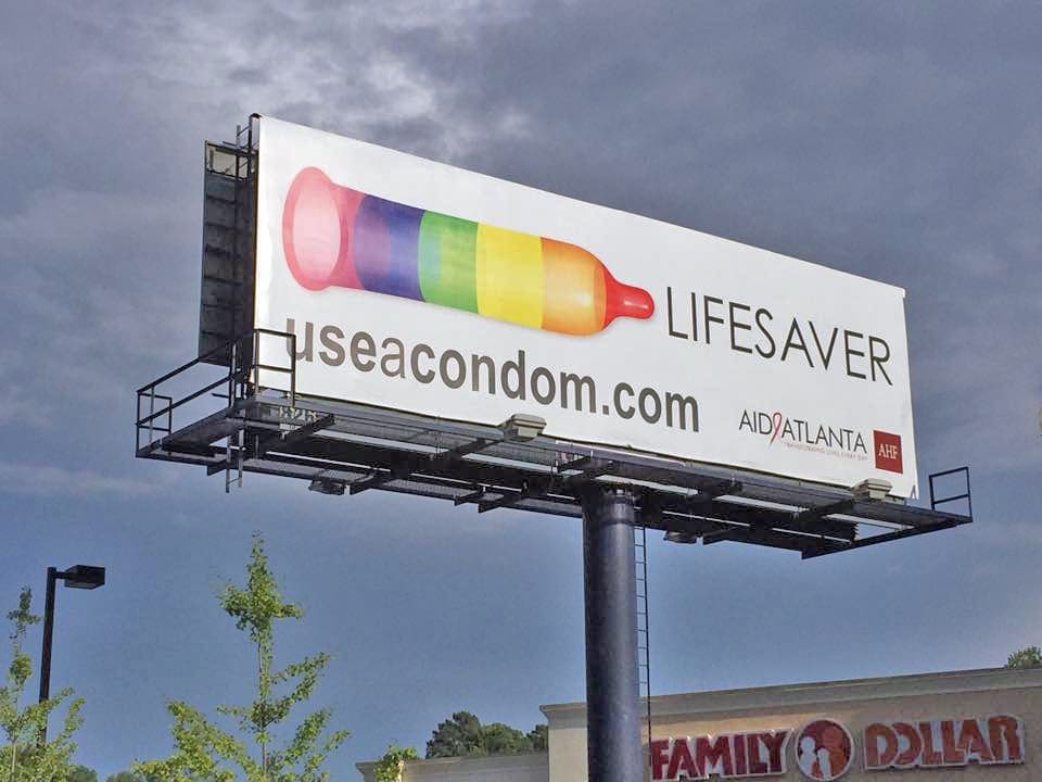
AID Atlanta
Rating: 4 (Very Good)
This billboard made me pull over and take this picture. The billboard is a fantastic street surface location near a busy 4 way intersection light. I could see the rainbow colors from several hundred feet away and apparently so did my 4 year old because she yelled out, “Mommy look! A colorful bottle!”.
- The graphic being reworked to display this colorful color scheme is creative and immediately eye catching
- Great contrasting colors on White background
- Large, easy to read URL
- AID Atlanta used the power of OOH perfectly to get a strong message across with a powerful visual and call to action
- I would have suggested leaving their logo off and centering the URL. I understand it is good to have the company listed but in this case by leaving their logo off, it would peak curiosity to know “who is behind the advertisement” and the public could find out by visiting the website
Paid Ad


