Rate This Board allows a billboard designer to rate a random piece of billboard artwork using the following scale: 1 (not good), 2 (below average), 3 (average), 4 (very good), 5 (great). Then the designer talks about what they may have done differently for outdoor advertising. This week’s rating is provided by Melody Roberts, an OBIE nominated billboard designer and founder of Out of Home Creative, an outdoor advertising design firm specializing in out of home design for businesses, agencies, media buyers and out of home companies. Melody has been in the outdoor industry since 1999. Insider uses and endorses her services.
US Egg
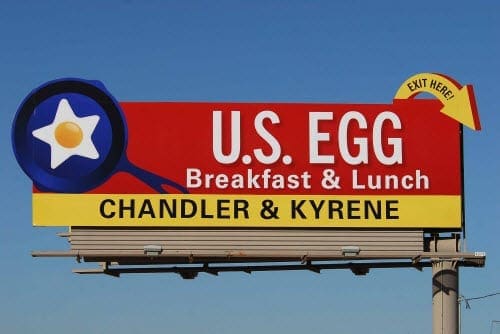
Rating 3 (average)
- Overall this is a good concept but I think it could have been tightened up and tweaked.
- I like the curved arrow as an extension, its fun and reminds me of a 50’s diner.
- The skillet is a great extension as well but unless this is their logo (I don’t know if it is or not), I would have set a photograph of a real skillet with fried eggs and bacon to bring the visual to life. I would have also placed it in front of the bottom banner with a drop shadow to create dimension.
- Using a Red gradient background would have also given this more depth.
- Finally, the wording is unbalanced. I would have either centered it correctly or made it all Right justified. Small tweaks like this can really change the visual of an advertisement.
[wpforms id=”9787″]
Paid Advertisement






Also what is going on with the arrow extension? Looks like they built it based off of the finished area? The red box/extension before the arrow really draws my eye to it and away from the ad itself. Seems like they weren’t quite sure on how to create the extension on the design side.