Rate This Board allows a billboard designer to rate a random piece of billboard artwork using the following scale: 1 (not good), 2 (below average), 3 (average), 4 (very good), 5 (great). Then the designer talks about what they may have done differently for outdoor advertising. This week’s rating is provided by Melody Roberts, an OBIE nominated billboard designer and founder of Out of Home Creative, an outdoor advertising design firm specializing in out of home design for businesses, agencies, media buyers and out of home companies. Melody has been in the outdoor industry since 1999. Insider uses and endorses her services.
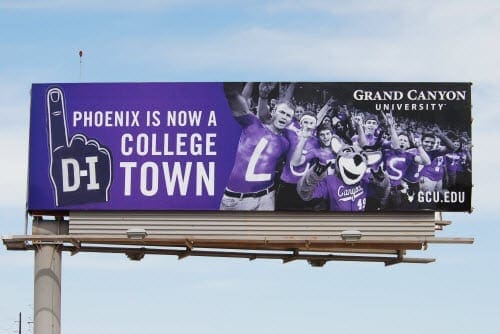
Grand Canyon University

Rating 3 (average)
- I think they had a good idea but the execution wasn’t laid out well. The name of the college and URL are too small.
- Group photos and or interior images (ex: kitchens and apartments) are difficult to make out driving by.
- A rule of thumb I try to press upon clients is use one main image, two if necessary (the second image should only be present to compliment the main image). Images are specific to the clients needs but here, by placing the focus on the #1 finger, it would have made the board stand out and emphasized the message more. If it was an extension, double that.
- By using one image, all the content could have been larger and on 2 lines. The bottom could have been dedicated to the college name and URL (depending on how you want to lay it out).
- I like the Purple background. I’ve stated in previous articles I don’t think it’s used enough and looks great on billboards.
[wpforms id=”9787″]


Who is it Advertising?