Rate This Board allows a billboard designer to rate a random piece of billboard artwork using the following scale: 1 (not good), 2 (below average), 3 (average), 4 (very good), 5 (great). Then the designer talks about what they may have done differently for outdoor advertising. This week’s rating is provided by Melody Roberts, an OBIE nominated billboard designer and founder of Out of Home Creative, an outdoor advertising design firm specializing in out of home design for businesses, agencies, media buyers and out of home companies. Melody has been in the outdoor industry since 1999. Insider uses and endorses her services.
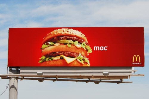
McDonald’s

Rating 5 (great)
- I hope we all strive to educate and produce advertisements like this for our clients whether they are local or national.
- I love the gradient Red background against the Blue sky and it is a great contrast to the product.
- I generally prefer logos be larger than this but we all know where to get a Big Mac.
[wpforms id=”9787″]
Paid Advertisement


