 Rate This Board allows a billboard designer to rate a random piece of billboard artwork using the following scale: 1 (not good), 2 (below average), 3 (average), 4 (very good), 5 (great).
Then the designer talks about what they may have done differently for outdoor advertising. Melody Roberts of Out of Home Creative rates this weeks’s art.
Design: Massage Envy
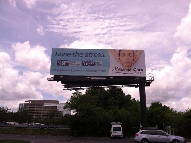
Rating: 2 (not good).
Comment:
- I can’t even read it from 2 feet away at my computer.
- The photo is the only thing I can easily make out allowing me to know it has something to do with a spa/massage.
- The #1 rule when it comes to color choices for outdoor advertising is do not use light Blue backgrounds because chances are your background will get lost against the sky.
- When designing an outdoor advertisement where most of your consumers are driving 55 mph+, it is important to determine what you want the consumer to take away. In this case, there’s more emphasis on the headline than the price point and most of the copy is too small to read. My suggestion would have been to make the promotion three times larger and either enlarged the logo under it or URL since their website is their name.
- The headline to me is secondary because your photo is basically saying the same thing. A visual can say a thousand words vs putting a thousand words on an advertisement to explain your photo.
Paid Advertisement
