Rate This Board allows a billboard designer to rate a random piece of billboard artwork using the following scale: 1 (not good), 2 (below average), 3 (average), 4 (very good), 5 (great). Then the designer talks about what they may have done differently for outdoor advertising. This week’s rating is provided by Melody Roberts, an OBIE nominated billboard designer and founder of Out of Home Creative, an outdoor advertising design firm specializing in out of home design for businesses, agencies, media buyers and out of home companies. Melody has been in the outdoor industry since 1999.
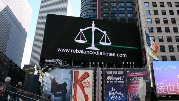
Rebalance Diabetes
Rating 3
- Good color contrast but overall I feel this awareness advertisement fell flat. My eye is drawn to the Kinky Boots advertisement underneath it and the point is to keep eyes on your Ad, not someone else’s.
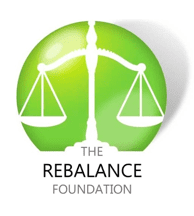
 The American Diabetes colors are Black and dark Red. Red = Alert/Alarm and I would have suggested going with a dark Red to pop in this location (especially against the high rises behind it). However, after visiting their website, I see their logo is a vibrant mix of Green and when applicable, I recommend clients stay with their color schemes throughout their advertising for consistency. This gradient mix of Green for the background of the board and reversed white with Black text would have really stood out in this space.
- I think most associate the “Scales of Justice” with attorneys so using this image in conjunction with diabetes may be a miss – maybe I’m wrong but I think attorney when I see this symbol (maybe I’ve just designed too many attorney billboards).=
- I don’t feel it’s necessary to use www in front of URL’s anymore. By leaving it off you gain a little more real estate to make your URL bigger. I feel it helps to capitalize the first letter of each word so it’s easier to read. May not work or be needed in all cases but I usually suggest it. For example, I think: RebalanceDiabetes.com reads better than www.rebalancediabetes.com
[wpforms id=”9787″]
Paid Advertisement



 The American Diabetes colors are Black and dark Red. Red = Alert/Alarm and I would have suggested going with a dark Red to pop in this location (especially against the high rises behind it). However, after visiting their website, I see their logo is a vibrant mix of Green and when applicable, I recommend clients stay with their color schemes throughout their advertising for consistency. This gradient mix of Green for the background of the board and reversed white with Black text would have really stood out in this space.