Rate This Board allows a billboard designer to rate a random piece of billboard artwork using the following scale: 1 (not good), 2 (below average), 3 (average), 4 (very good), 5 (great). Then the designer talks about what they may have done differently for outdoor advertising. This week’s rating is provided by Melody Roberts, an OBIE nominated billboard designer and founder of Out of Home Creative, an outdoor advertising design firm specializing in out of home design for businesses, agencies, media buyers and out of home companies. Melody has been in the outdoor industry since 1999.
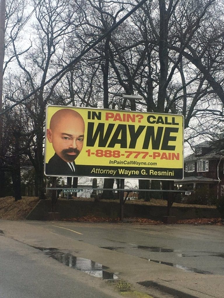
Wayne Resmini
Rating 4
Talk about a visual you won’t ever forget… having an illustration of yourself or mascot can be a real payoff symbolizing your brand. I would bet most will remember this advertisement simply because of his alternate image and definitely associate it with his name WAYNE.
These are your old school trusty colors; Black, Yellow and Red. I try to be more creative and show alternative color schemes that contrast just as well but at the end of the day this trio really plays off each other.
A few suggestions I would have recommended the client consider:
- Move “Call” next to WAYNE” so you could enlarge both lines not just his name.
- If the call to action is to make that call then dropping the “1-“ and having the 888 on one line and 777-PAIN underneath really large would have been better. As is, there’s so much focus on WAYNE and I feel like his number is not standing out (vanity numbers and URL’s are memorable so make them as big as possible).
- If the focus was on the number, no need to add the URL. By leaving it off, it would have given a little more room to modify the above suggestions.
[wpforms id=”9787″]
Paid Advertisement
