Rate This Board allows a billboard designer to rate a random piece of billboard artwork using the following scale: 1 (not good), 2 (below average), 3 (average), 4 (very good), 5 (great). Then the designer talks about what they may have done differently for outdoor advertising. This week’s rating is provided by Melody Roberts, an OBIE nominated billboard designer and founder of Out of Home Creative, an outdoor advertising design firm specializing in out of home design for businesses, agencies, media buyers and out of home companies. Melody has been in the outdoor industry since 1999.
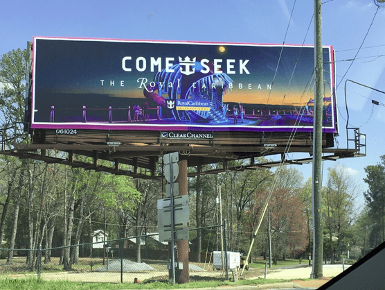
Royal Caribbean
Rating 4 (very good)
- Royal Caribbean has received positive feedback for their “COME SEEK” campaign. Until now, I’ve only seen it on interstate locations but today I saw this billboard at a four-way intersection. Even though the advertisement is a little obstructed by cables, the board is very low and you are at a stop light for a while. Three different directions are able to view the advertisement and probably like me, wish they were on a cruise vs sitting in traffic.
- This advertisement is strategically placed (or I like to think so) at the beginning of a dense suburb area so it speaks to a huge target audience of families or parents who need an escape.
- The advertisement is not only engaging but is also rich in colors. I’ve been saying Purple should be used more (especially on digital) and it translates beautifully here.
- The only reason I didn’t rate this a 5:
- Even though I know it’s Royal Caribbean, I think their logo is a little small and lost. I would have suggested to place it top Right and a little larger. On interstate boards you can’t see it.
- In this case, a drop shadow behind the text “The Royal Caribbean” would not only help their company name pop, but give it some depth.
- I know what it’s like to work with an agencies pool of images (which are not normally ideal for outdoor advertising) so trying to find the perfect photo for a rectangle space can be tough. I think they tried to squeeze the moon in on the top and it could have been cropped out. My eye keeps going up to it and I feel like it’s more of a dot. Had they cropped it out it would have been a nice, crisp border.
[wpforms id=”9787″]
Paid Advertisement
