


Rate This Board allows a billboard designer to rate a random piece of billboard artwork using the following scale: 1 (not good), 2 (below average), 3 (average), 4 (very good), 5 (great). Then the designer talks about what they may have done differently for outdoor advertising. This weeks rating is provided by Melody Roberts. Melody Roberts is a billboard designer and founder of Out of Home Creative, an outdoor advertising agency specializing in creating unique out of home designs for businesses, agencies, media buyers and out of home companies.
Blue Man Group
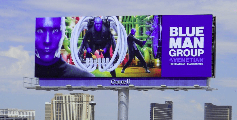
Rating: 4 (good)
At its best, Out of home advertising should use vibrant colors and the photo on this Blue Man Group billboard does just that. While the main photo ‘pops’, the most important copy on the right side is not visible.
- The venue location copy should have been in a more contrasting color such as Yellow.
- The call-to-action font size for the ticket number and website are too small.
- I would have encouraged the client to display either the number or website and made that copy the same size as the venue name.
Paid Ad