Rate This Board allows a billboard designer to rate a random piece of billboard artwork using the following scale: 1 (not good), 2 (below average), 3 (average), 4 (very good), 5 (great). Then the designer talks about what they may have done differently for outdoor advertising. This week’s rating is provided by Melody Roberts. Melody Roberts is a billboard designer and founder of Out of Home Creative, an outdoor advertising agency specializing in creating unique out of home designs for businesses, agencies, media buyers and out of home companies.
The Edible Schoolyard
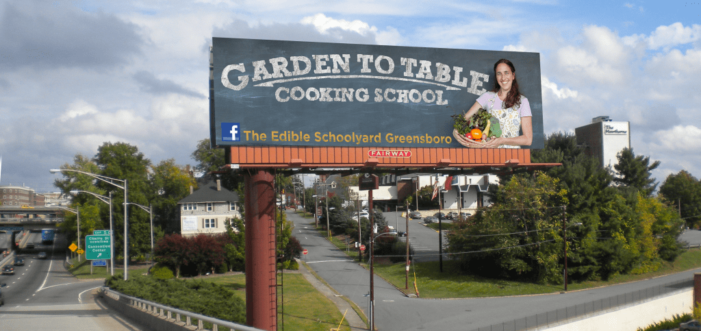
Rating: 3 (average)
I think they were on a good path but fell short on the creative.
- I would have suggested a larger picture of food (on the Right side) and used a rustic parchment paper background allowing the colorful food to stand out more.
- Normally, I would not use fonts like this because they’re hard to read but because of the billboard’s proximity to the street surface, this may afford them more eyes-on at a lower level.
- Unique fonts have their place in outdoor advertising but I would have laid this out differently by stacking the main headline and subhead using a fun, bold script and serif font might have helped with the overall message.
- Text at the bottom of the billboard should have been a light font color on top of a contrasting banner color.
Paid Ad
