Rate This Board allows a billboard designer to rate a random piece of billboard artwork using the following scale: 1 (not good), 2 (below average), 3 (average), 4 (very good), 5 (great). Then the designer talks about what they may have done differently for outdoor advertising. This week’s rating is provided by Greg Callaham www.gregcallaham.com) who has 30 years of experience in outdoor advertising design. Insider uses and endorses Callaham’s services.
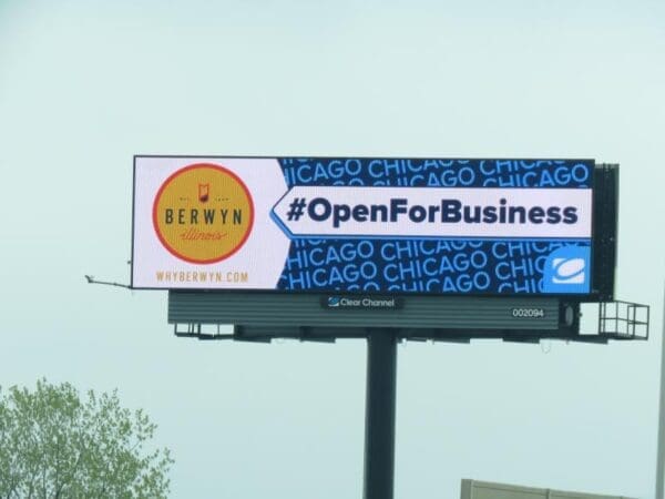
Open For Business
Rating: 2 (below average)
Our Rate This Billboard example this week is the Open For Business donut pictured above. There are many similar ads going up all over the country. It’s a great way to build community enthusiasm and demonstrate an OOH media outlet’s involvement in helping the local economy during this pandemic. These ads not only have to fall within the parameters of good outdoor, but also should be a bit more selfless than usual, if only to earn a few extra PR brownie points.
- In this ad for Berwyn, Illinois, there’s a large area for the featured advertiser on the left, but that forces the eye into an awkward right-to-left read flow with the arrow pointing to the left.
- There’s a lot, a LOT, of competition for the target audience’s attention between the logo, the arrow, and the background.
- The word “Chicago” as a background pattern adds clutter and creates a distraction.
- The logo in the lower right is just one more element the reader must decipher and also saps the ad’s altruistic spirit, especially since there is a clearly visible apron plaque.
- This one earns a 2 (below average).
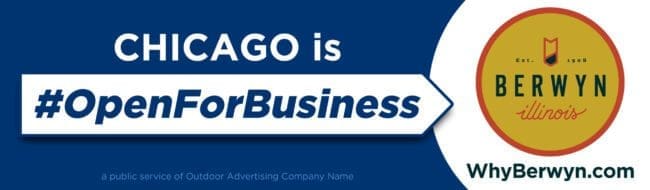
- Given the opportunity, I would have encouraged the use of the layout below.
[wpforms id=”9787″]
Paid Advertisement