Rate This Board allows a billboard designer to rate a random piece of billboard artwork using the following scale: 1 (not good), 2 (below average), 3 (average), 4 (very good), 5 (great). Then the designer talks about what they may have done differently for outdoor advertising. This week’s rating is provided by Greg Callaham www.gregcallaham.com) who has over 30 years of experience in outdoor advertising design. Insider has used and endorses Callaham’s services.

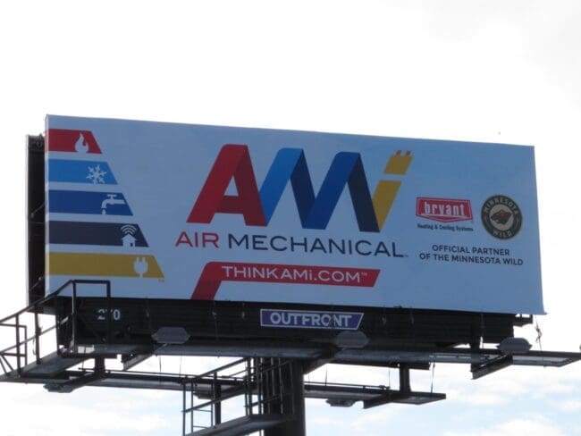
AMI
Rating: 3 (average)
- This board does a fairly good job of reinforcing brand awareness. The logo is big and centered. Frankly, it’s about all the target audience can read.
- The web address is too small and thin, while the service graphics on the left beg to be enlarged so the icons can be easily interpreted.
- As for the Bryant and Wild partner info, it eats valuable ad space without really increasing advertiser ROI. However, co-op money is co-op money and that’s usually the end of the argument.
- The horizontal arrangement hurts the effectiveness of this ad.
- With all the extra white space and the opposing angles of the service graphics to the logo, there’s room for improvement. The board earns a (3 average).
I do not know the history of this ad from art request to final approval, but I would have strongly encouraged the advertiser to run something like the layout below.

[wpforms id=”9787″]
Paid Advertisement


