Rate This Board allows a billboard designer to rate a random piece of billboard artwork using the following scale: 1 (not good), 2 (below average), 3 (average), 4 (very good), 5 (great). Then the designer talks about what they may have done differently for outdoor advertising. This week’s rating is provided by Greg Callaham www.gregcallaham.com) who has 30 years of experience in outdoor advertising design. Insider has used and endorses Callaham’s services.
Chico Eye Center
Rating: 2 (below average)
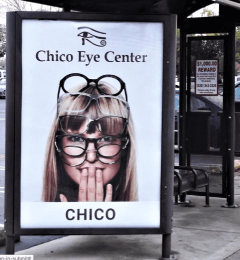
- This bus shelter ad does a very good job of capturing the attention of the target audience. A large image of an attractive model grabs the eye.
- But then it fails to explain itself. Perhaps this is part of a larger campaign of similar, more informative ads across a variety of media platforms. Perhaps this is simply meant to be a brand awareness piece. Why is the name on the ad twice? Perhaps the other side of this panel explains how you can buy five pairs of glasses for the price of one. Is there a reason why the model is holding her hand over her mouth? Did she spend too much on eyewear?
- By leaving so many potential questions unanswered, the advertiser loses control of the message they’re paying for, reducing the potential ROI. This ad earns a 2 (below average).
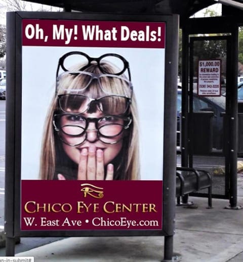
I don’t know the back story on this ad, but given what I have in front of me, I would have encouraged the advertiser to run something more like the ad below. I pulled corporate colors from the website for brand integrity. Then I added a short headline to explain the visual and contact info below the logo. In about three steps, a pedestrian can read, understand, and remember Chico has good prices on eyewear, and where they are located in town and on the web.
[wpforms id=”9787″]
Paid Advertisement