Rate This Board allows a billboard designer to rate a random piece of billboard artwork using the following scale: 1 (not good), 2 (below average), 3 (average), 4 (very good), 5 (great). Then the designer talks about what they may have done differently for outdoor advertising. This week’s rating is provided by Greg Callaham www.gregcallaham.com) who has 30 years of experience in outdoor advertising design. Insider has used and endorses Callaham’s services.
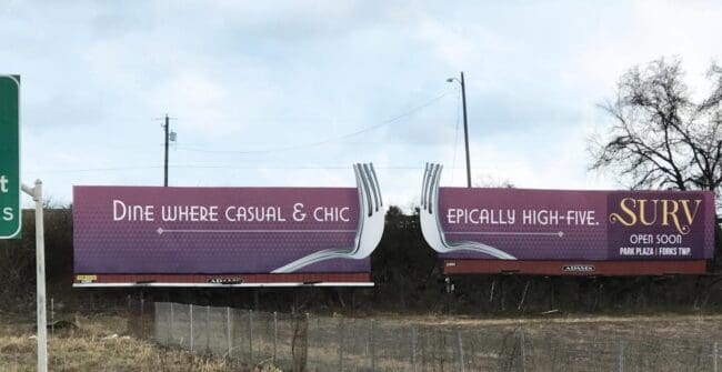
Surv
Rating: 4 (very good)
The two Surv billboards make good use of our beloved medium.
- They use extensions to gain attention.
- They use over-sized everyday objects to gain attention.
- They depict those objects doing something out of the ordinary to gain attention.
- They use shades of purple and violet to gain attention.
- They make one ad span two side-by-side boards to create even more visual interest to gain attention.
- And then they use a thin, all-caps, highly stylized font for the headline. Thin fonts are harder to read on outdoor. All caps are harder to read on outdoor. Stylized fonts are harder to read on outdoor. As a graphic designer, I agree with that the font choice works with the “look and feel” I interpret from the logo and what I read about the restaurant online. But as a billboard graphic designer, I believe it makes the ad more difficult to read for the target audience. It’s not impossible, but it’s harder than it had to be and our job as billboard designers is to make it easy to read.
This board would have been a 5 (great) except for all cap stylized harder to read fonts which lower the rating to a 4 (very good).
[wpforms id=”9787″]
Paid Advertisement