Rate This Board allows a billboard designer to rate a random piece of billboard artwork using the following scale: 1 (not good), 2 (below average), 3 (average), 4 (very good), 5 (great). Then the designer talks about what they may have done differently for outdoor advertising. This weeks rating is provided by Greg Callaham www.gregcallaham.com) who has 30 years of experience in outdoor advertising design. Insider uses and endorses Callaham’s services.
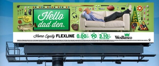
WesBanco
Rating: 1 (Not Good)
- I looked at this billboard for seven seconds and then closed my eyes and asked myself what it is selling. I didn’t know.
- I get what the advertiser is trying to do here, but it works better for a magazine ad, a brochure, or a direct mailer than for outdoor advertising.
- Good outdoor advertising never challenges the target audience to read and understand it. This ad is a huge challenge, which makes it difficult to understand.
- The visual is cluttered and confusing.
- The large text is script, therefore, a little harder read while driving.
- The text at the bottom is too small and contains too many characters.
- The logo is too small and easily missed.
- This ad does not sell anything. It doesn’t even make the phone ring because drivers don’t know who to call to ask, “What does your billboard say?” This ad earns a 1 (not good).
I do not know the back story on the ad, but if given the opportunity I would have strongly encouraged the advertiser to run something more like what’s pictured below. It literally uses the same image the advertiser is using on their web page promoting the home equity line of credit, so there is built-in visual messaging consistency. The ad copy is simplified, the logo is larger, and the web address is included for the target audience to visit for more details.

[wpforms id=”9787″]
Paid Advertisement