Rate This Board allows a billboard designer to rate a random piece of billboard artwork using the following scale: 1 (not good), 2 (below average), 3 (average), 4 (very good), 5 (great). Then the designer talks about what they may have done differently for outdoor advertising. This week’s rating is provided by Greg Callaham www.gregcallaham.com) who has 30 years of experience in outdoor advertising design. Insider has used and endorses Callaham’s services.
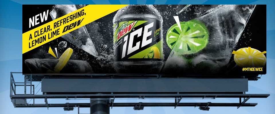
Mountain Dew Ice
Rating: 3 (Average)
- This might be an example of the advertiser being a little too close to the product to step back and objectively create a strong outdoor ad.
- The photo used is the hero shot featured in nearly all other promotions for the new Ice flavor from Mtn Dew. It’s a pretty cool photo when you can see the whole thing.
- I am a huge proponent of consistency in branding and messaging. However, some of the engaging, energizing photo elements in this image become clutter in the close-up.
- Several things competing for my attention: the yellow strip, a big logo, some round things, and what is going on with the white stuff? …And my 7-second read is over. I got “New” and “Ice” out of it. The consistency of branding got in the way of clear communication.
- The most important thing we all have to ask ourselves and our advertisers is “What are we trying to say to the target audience?” Then we can evaluate the design by asking “Does this ad clearly communicate what we want to say?” This ad does not say it clearly. It earns a 3 (average).
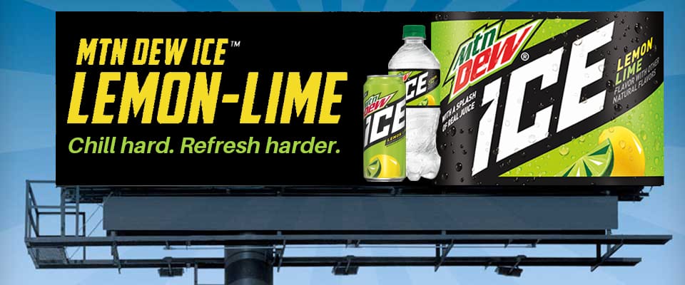
Given the opportunity, I would encourage the advertiser to to make make the selling message clear. Using design elements and text from the Mtn Dew web site, maybe something like this:
[wpforms id=”9787″]
Paid Advertisement