Rate This Board allows a billboard designer to rate a random piece of billboard artwork using the following scale: 1 (not good), 2 (below average), 3 (average), 4 (very good), 5 (great). Then the designer talks about what they may have done differently for outdoor advertising. This weeks rating is provided by Greg Callaham www.gregcallaham.com) who has 30 years of experience in outdoor advertising design. Insider has used and endorses Callaham’s services.

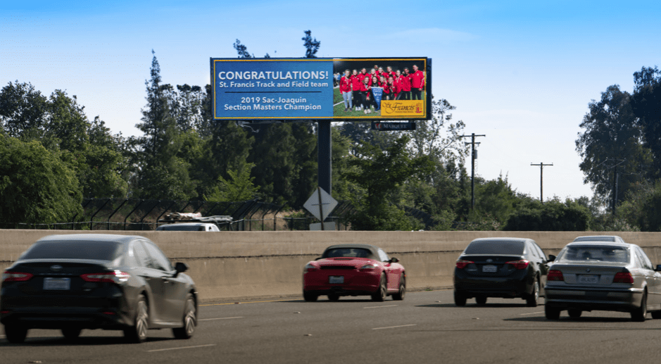
Congratulations – St Francis
Rating 3 (average)
- Billboards offering congratulations to local sports teams, graduating classes, or other groups present us with a significant challenge. In most cases, the advertiser wants to incorporate a photo of the group. More than likely it was shot with a cell-phone, in bad lighting, by an amateur, with the group arranged in 2 or 3 long horizontal rows. In a perfect world, we would get the chance to coach the photographer before they shoot the picture; or give them a pre-designed layout to use as a guide when they pose their group.
- The example pictured is a very nice layout for such a design challenge. The large box on the left gives us plenty of room for the message and the box on the right gives us a decently sized photo. Since such boards are not truly selling anything, the word count will most likely be a tad high. The target audience is parents, friends, and relatives of those pictured so the achievement is noticed and commented on.
- I understand the organizations may see this as an opportunity for self-promotion and to encourage new membership, but they should really run a more traditional, selling-message-driven ad for that purpose.
- If you haven’t done so already, I would encourage you to design three or four templates of various sizes to accommodate various photo styles so when you receive such a project, you have the flexibility to produce the design quickly and efficiently.
[wpforms id=”9787″]
Paid Advertisement


