


Rate This Board allows a billboard designer to rate a random piece of billboard artwork using the following scale: 1 (not good), 2 (below average), 3 (average), 4 (very good), 5 (great). Then the designer talks about what they may have done differently for outdoor advertising. This weeks rating is provided by Greg Callaham www.gregcallaham.com) who has 30 years of experience in outdoor advertising design. Insider uses and endorses Callaham’s services.
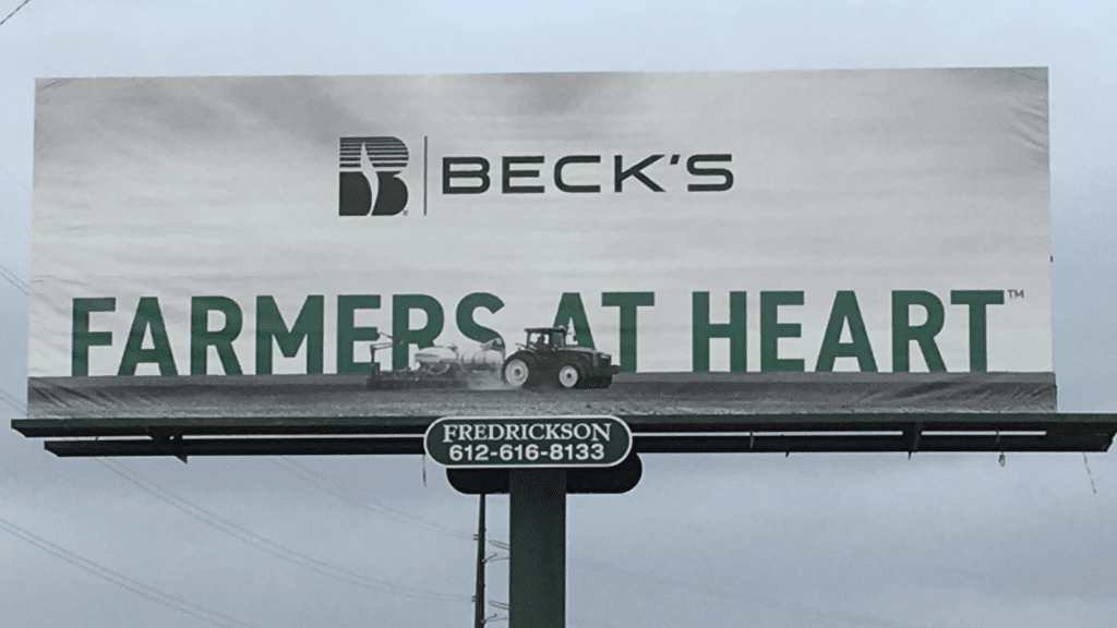
Becks
Rating: 3 (average)
- This board does an excellent job of getting the logo and slogan in front of John Q. Public. Unfortunately, it makes a huge assumption that Mr. Public is familiar with Beck’s and what they do, knowledge that is critical to understanding the slogan. I had to look them up online, find out they sell seeds, and then I could understand why they are farmers at heart.
- This photo was taken on a cloudy day so the green of the slogan text is a bit muted. The rest of the ad is black and white. It’s a nice design tactic, but works best when the emphatic color is brighter and really gives the ad enough “pop” to make the target audience look.
- I would have encouraged the advertiser to use their full color logo instead of the black-only version and I would have made it larger.
- Adding the word “seeds” under it would clearly communicate their awareness message.
- I like the depth generated by placing the tractor in front of the slogan, but I would have moved all that up to clear the catwalk for better line of sight and balance.
- I would have also pushed hard for a brighter green.
- This one gets a 4 for design and a 2 for message communication, earning a solid 3.
[wpforms id=”9787″]
Paid Advertisement


