Rate This Board allows a billboard designer to rate a random piece of billboard artwork using the following scale: 1 (not good), 2 (below average), 3 (average), 4 (very good), 5 (great). Then the designer talks about what they may have done differently for outdoor advertising. Today’s rating is provided by Greg Callaham www.gregcallaham.com) who has 30 years of experience in outdoor advertising design. Insider uses and endorses Callaham’s services.

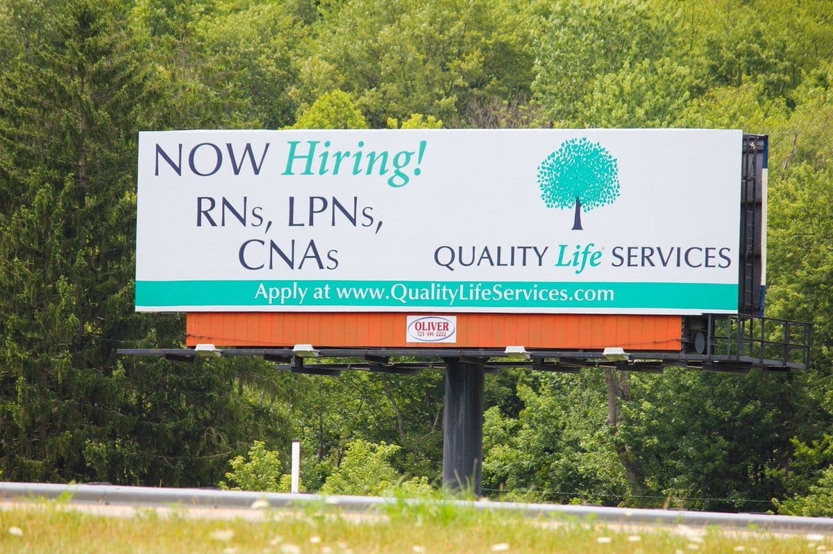
Now Hiring
Rating: 3 (average)
- This board represents the typical “Now Hiring” ad I encounter, especially for the medical industry. Big logo, big headline, itty-bitty contact info.
- Branding standards and hospital marketing directors directly influence the size of the elements and the color palette. They should; they are paying for the ad. Our challenge as art directors and designers is to position ourselves and our sales force as experts who know how to maximize the effectiveness of the billboard while still making the design look like part of the family of the client’s advertising seen in other media.
- The main area of concern here is the contact info. It’s small, thin, and a bit dated. Good job on capitalizing the web address; that breaks it into words and makes it easier to read. The “www” is not necessary in 2018 and just adds cutter. This board is a solid 3 (average).
- I would have kept the headline in the primary high-contrast color to grab the eye and used the secondary color for the positions to be filled, maybe even darken it a little to boost legibility. The logo is a good size and needs to be large due to the thin text. I would suggest making the contact info large and bold, higher contrast for easier reading, and drop the www. See below:

[wpforms id=”9787″]
Paid Advertisement


I would drop the business name as it’s redundant to the website. Too many words to read at 70 mph at 70 feet high…something gets missed!