Rate This Board allows a billboard designer to rate a random piece of billboard artwork using the following scale: 1 (not good), 2 (below average), 3 (average), 4 (very good), 5 (great). Then the designer talks about what they may have done differently for outdoor advertising. This weeks rating is provided by Greg Callaham www.gregcallaham.com) who has 30 years of experience in outdoor advertising design. Insider has used and endorses Callaham’s services.

Planet Fundraiser
Rating: 2 (below average)
- This board for Planet Fundraiser is a fairly nice magazine ad. Unfortunately magazine ads make sub-par billboards.
- I have no problem with the headline. It’s large, it’s sort of clever, it’s pretty easy to read. After that, the target audience is left to wonder why they are supposed to say bye-bye to bake sales.
- Did bakes sales do something wrong? Nope. In all that tiny grey, all-caps print is a description for the script logo of the advertiser. It’s too small to read and all-caps only raises the level of difficulty, especially with a condensed font and customized kerning.
- The photo of the phone is actually made more difficult to recognize by the extreme close-up crop. Because the advertiser’s name is so hard to read I’ve got to give this one a 2 (below average).
Here is the first proof I would have suggested to the advertiser for making better use of our medium. While this design will not win any awards, it delivers the selling message quicker and easier.
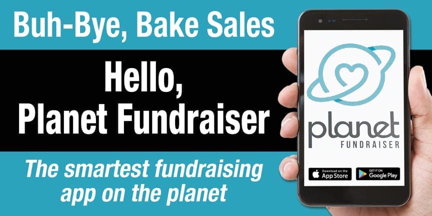
- There is a follow-up to the headline completing the thought and tying directly to the advertiser. The additional text means we step away from all-caps and use upper- and lowercase text. That’s okay because it’s actually easier to read.
- The background still uses the logo color, but it’s from the shadow portion to increase our contrast with the text.
- The description of the product is larger and more legible. The entire shape of the phone is shown making it instantly recognizable.
- The logo is slightly modified and enlarged on the screen with the app store logos underneath to provide visually clues as to what we’re selling.
- All text is high contrast and easy to read.
- The word count is thirteen, right there at that 12-word sweet spot for effective OOH.
[wpforms id=”9787″]
Paid Advertisement







I would say the sweet spot for words is more like seven rather then 12 or 13 words.. typically have about 5-7 seconds to digest the billbaord